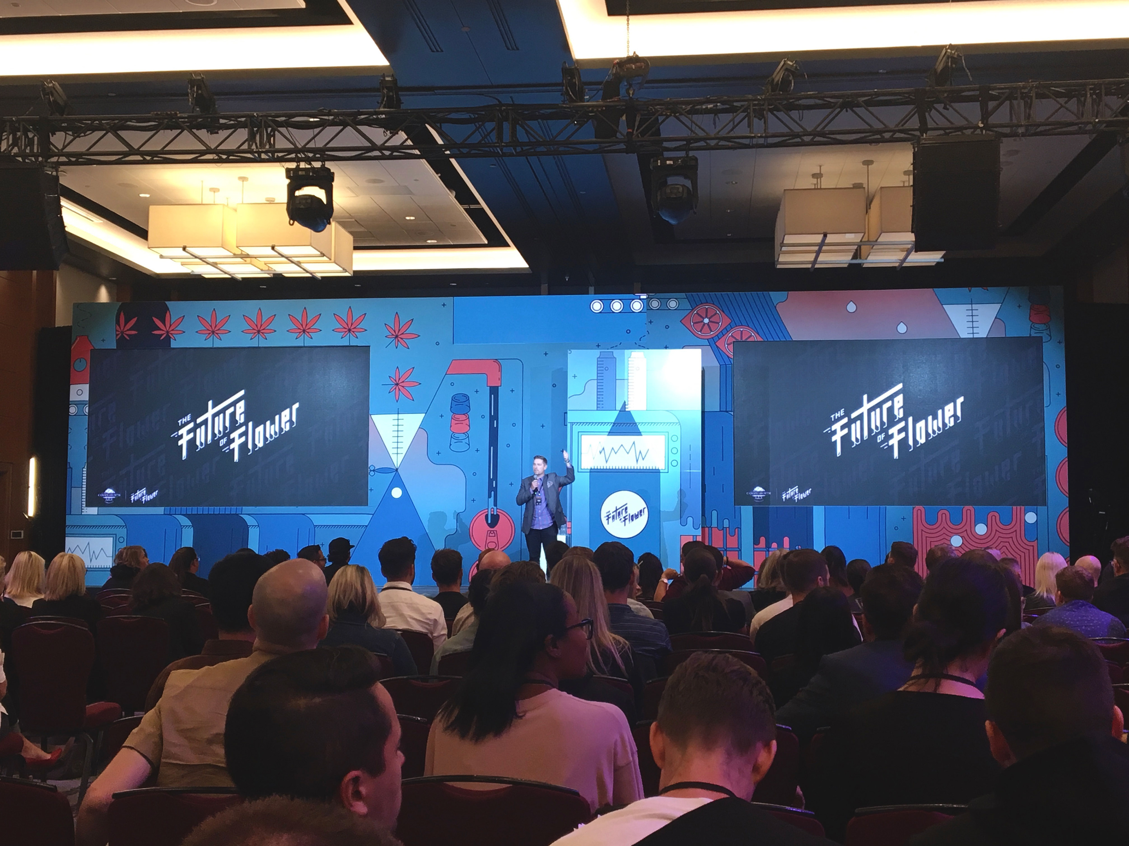
Canopy Growth is a household name in terms of pioneering the world of legal cannabis.
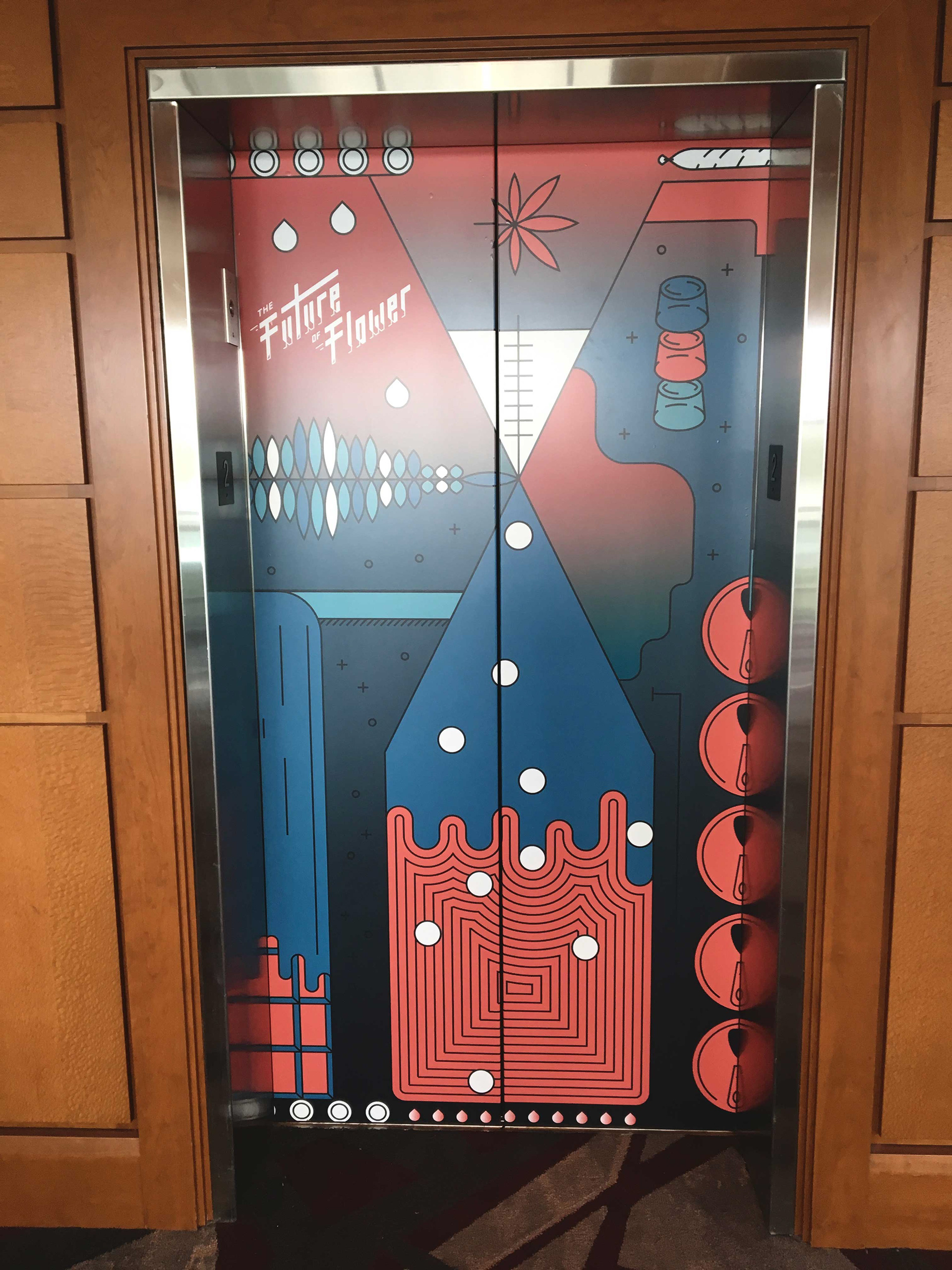
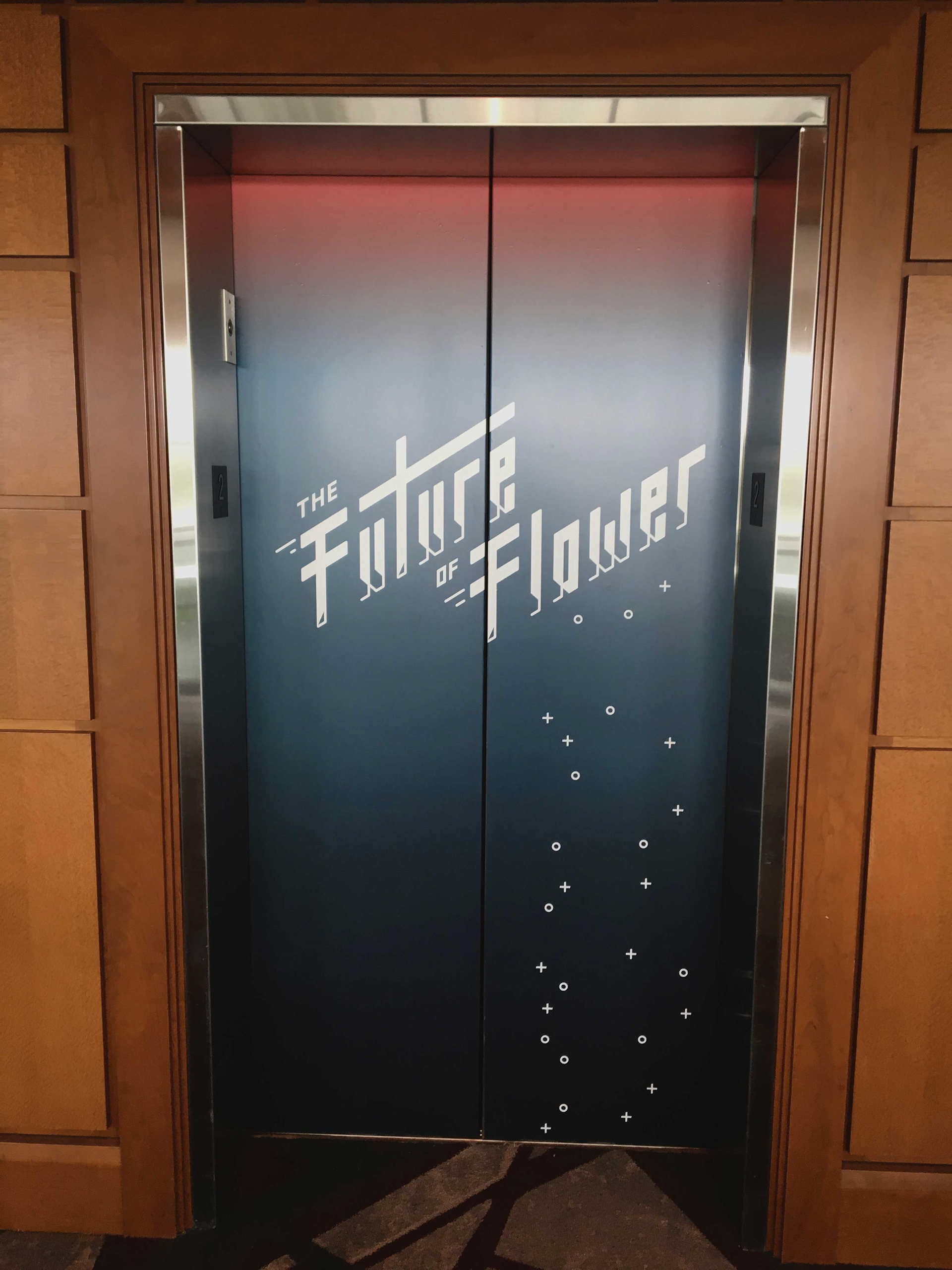
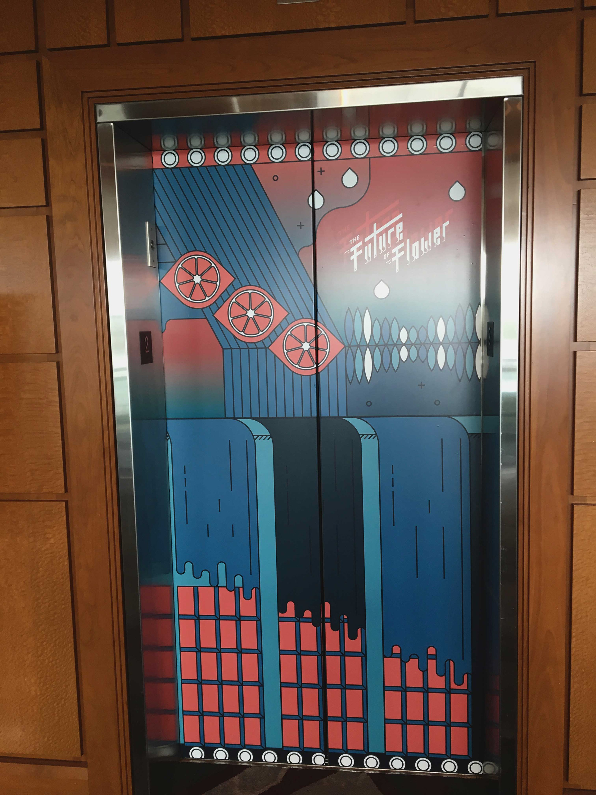
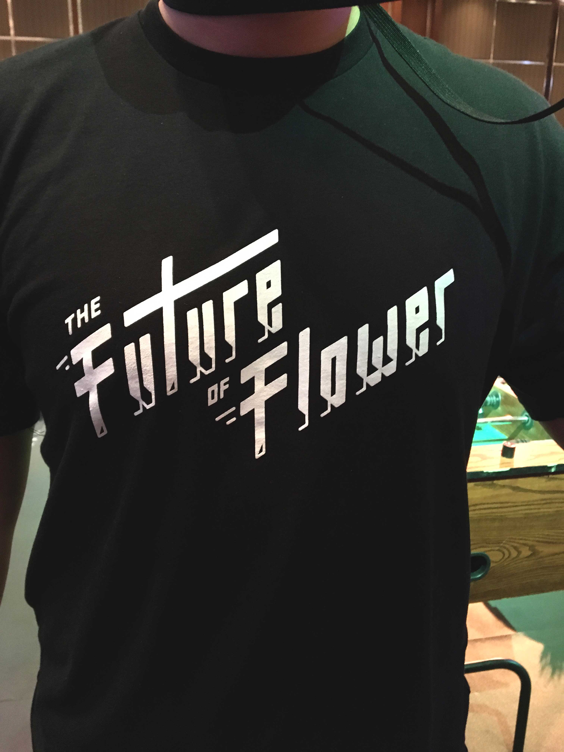
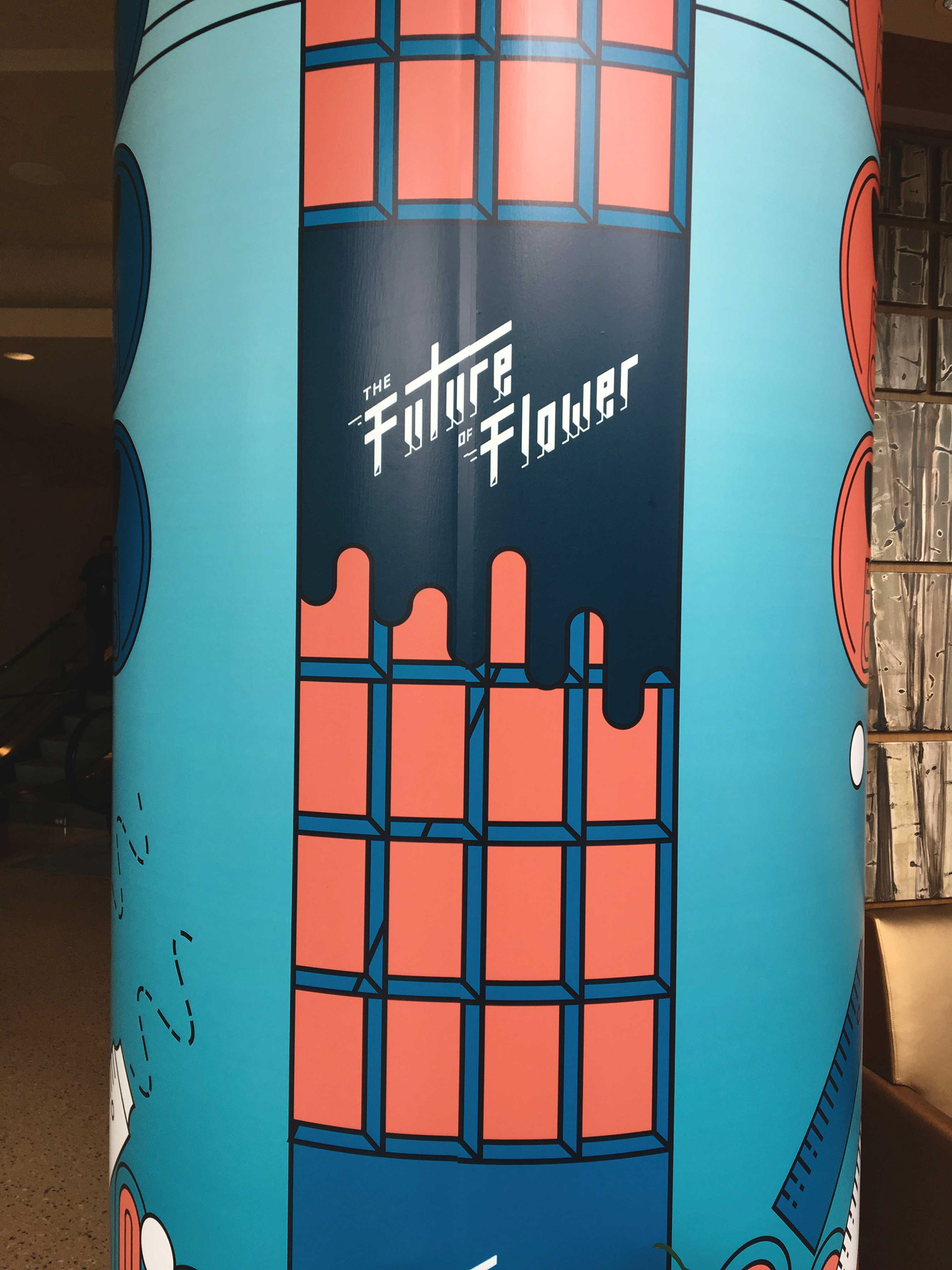
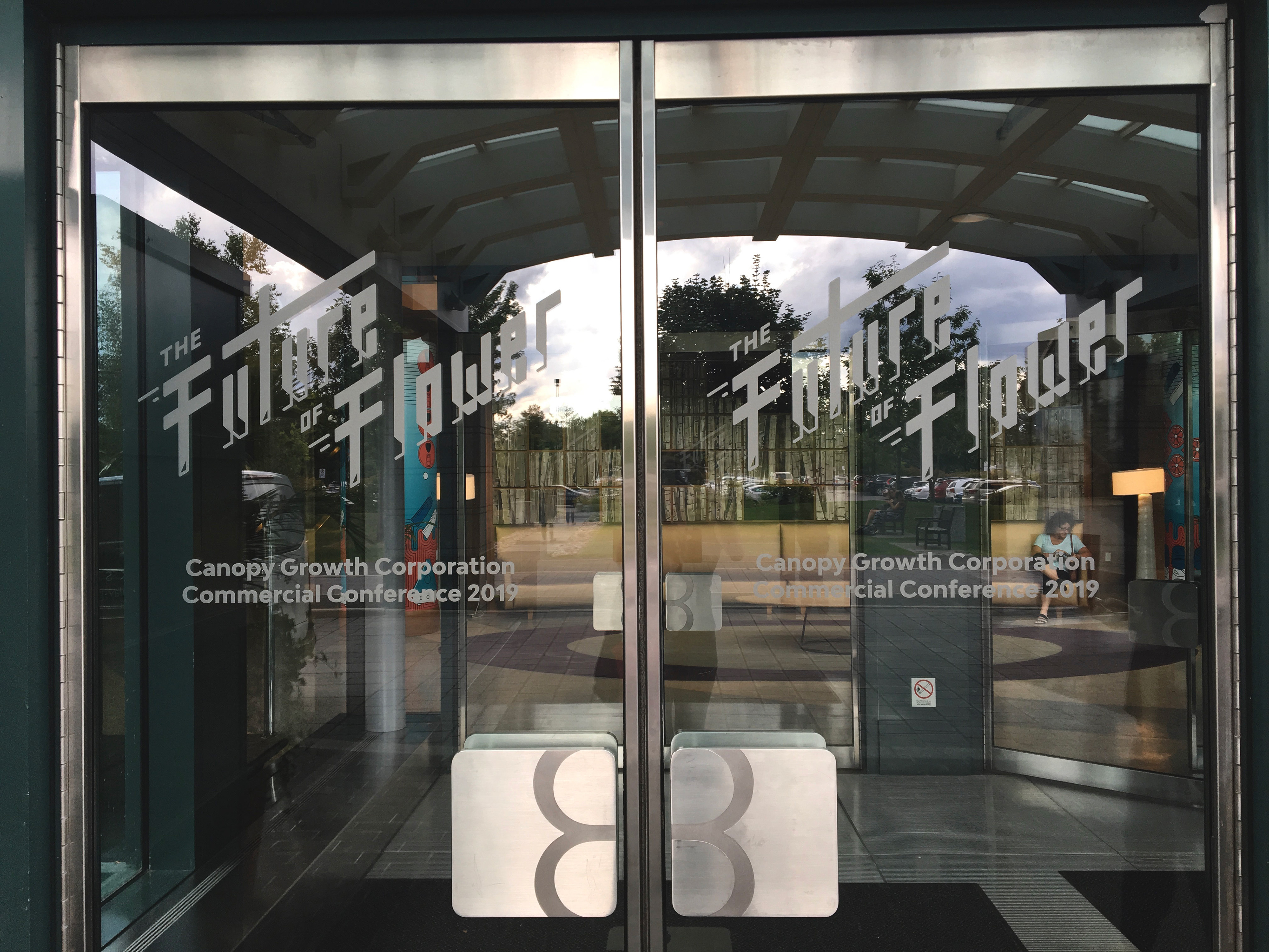
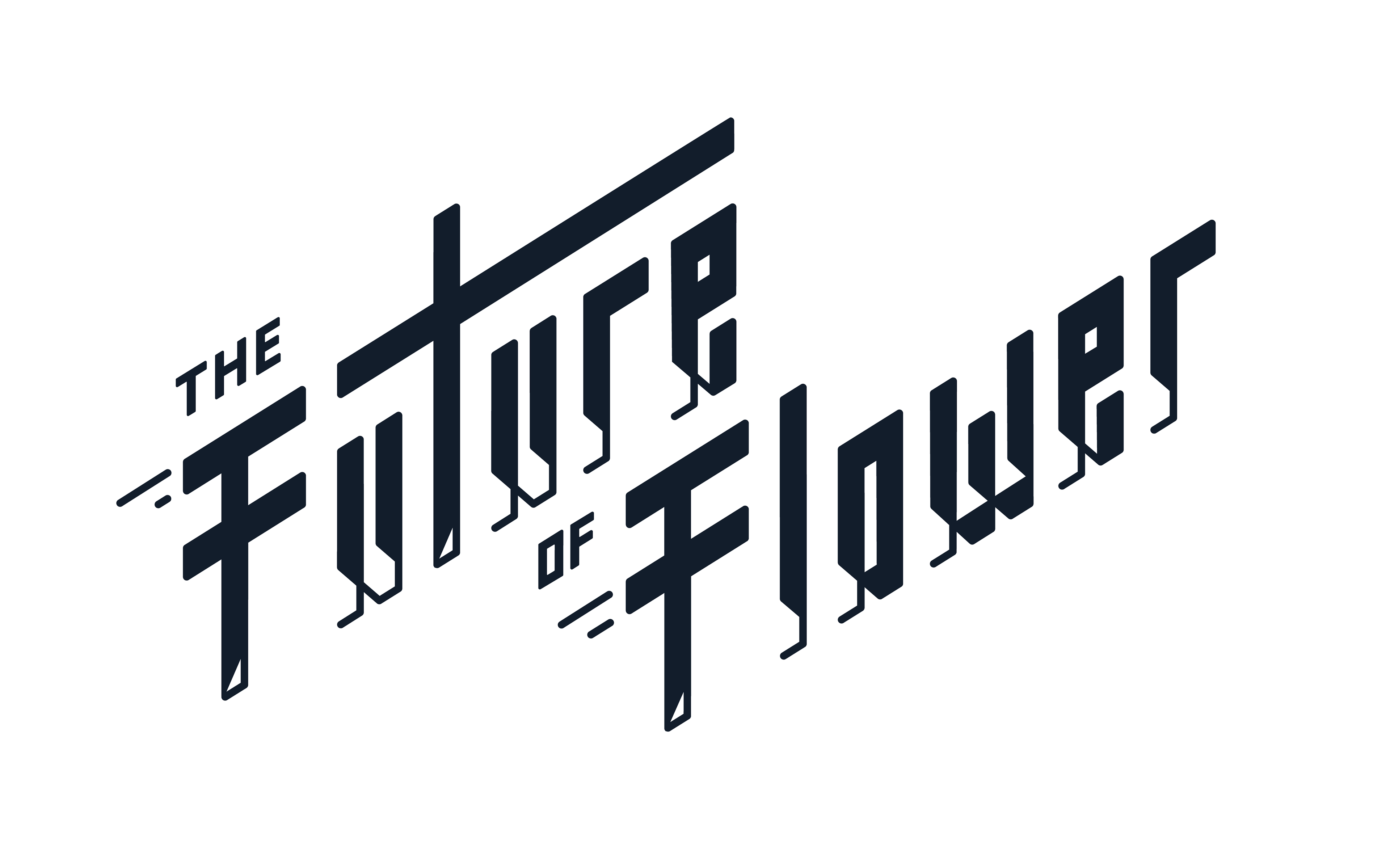
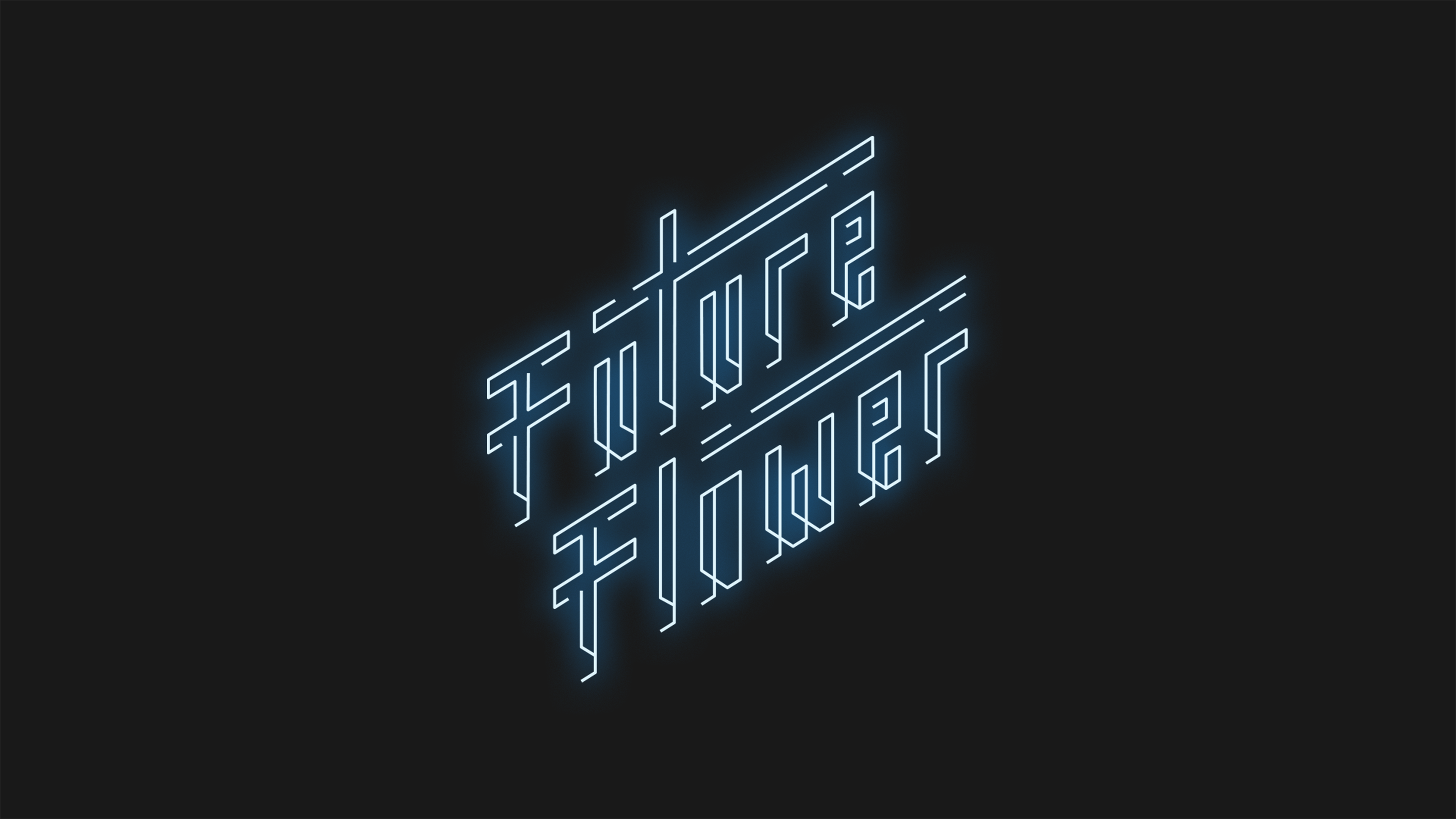
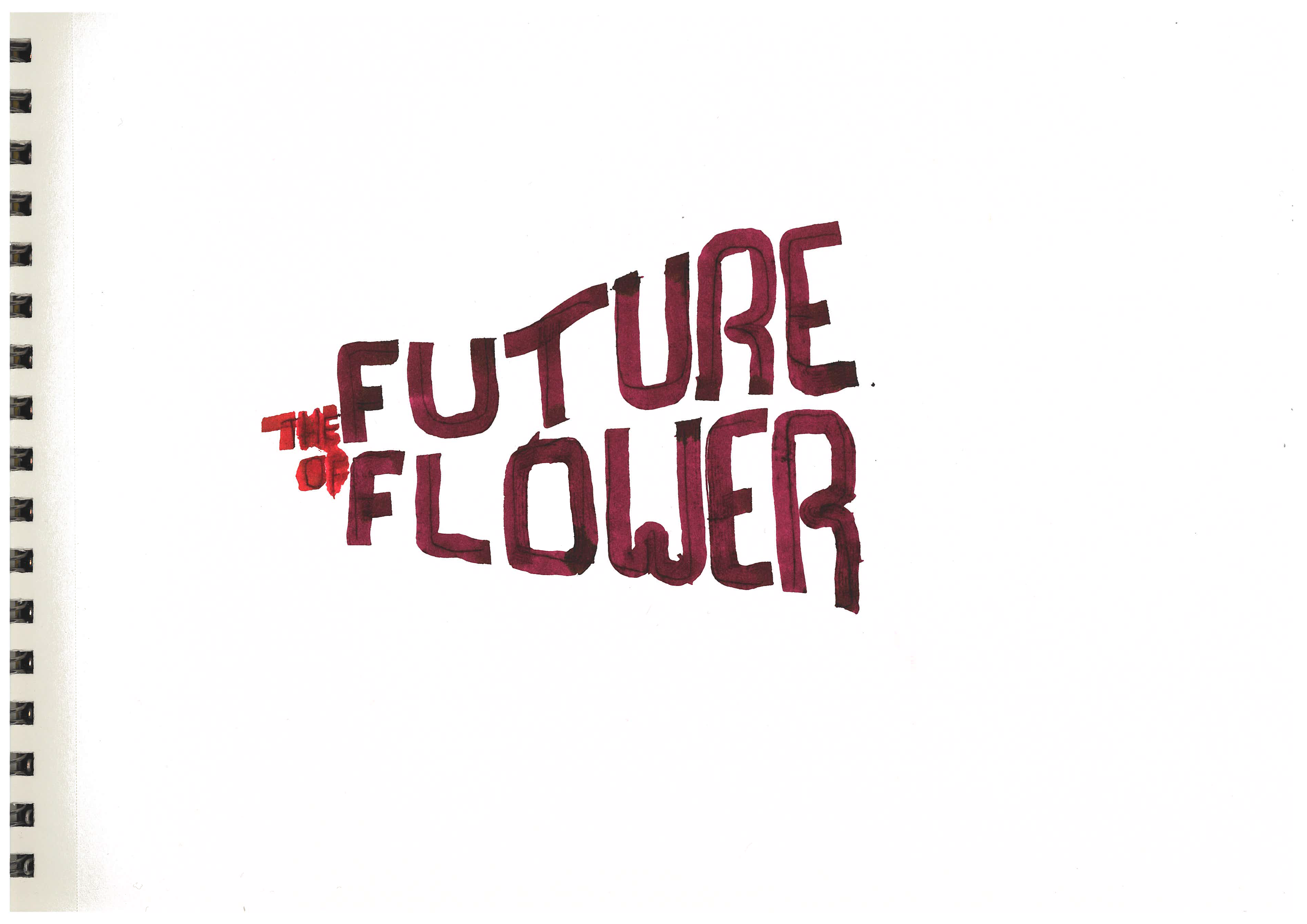
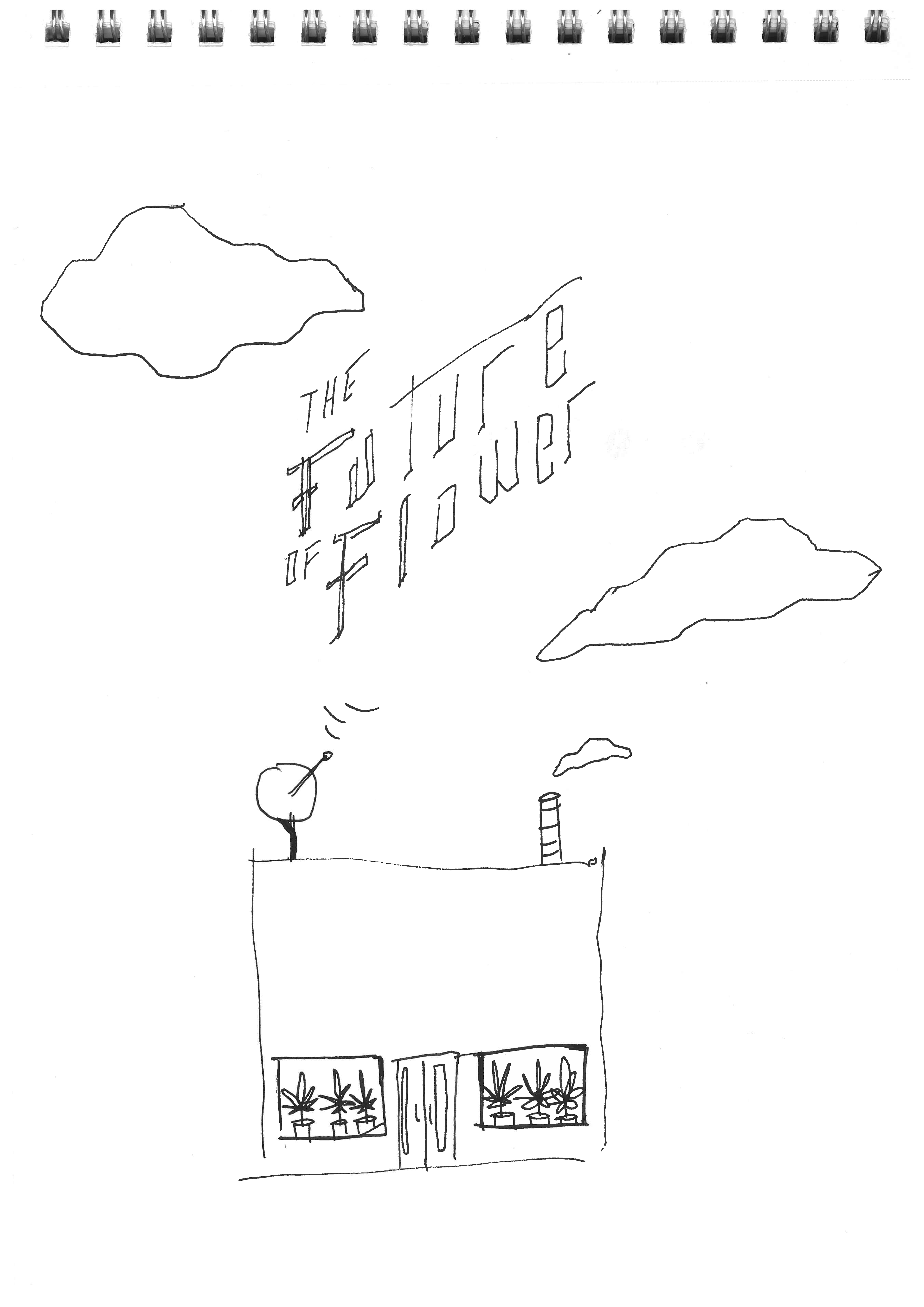
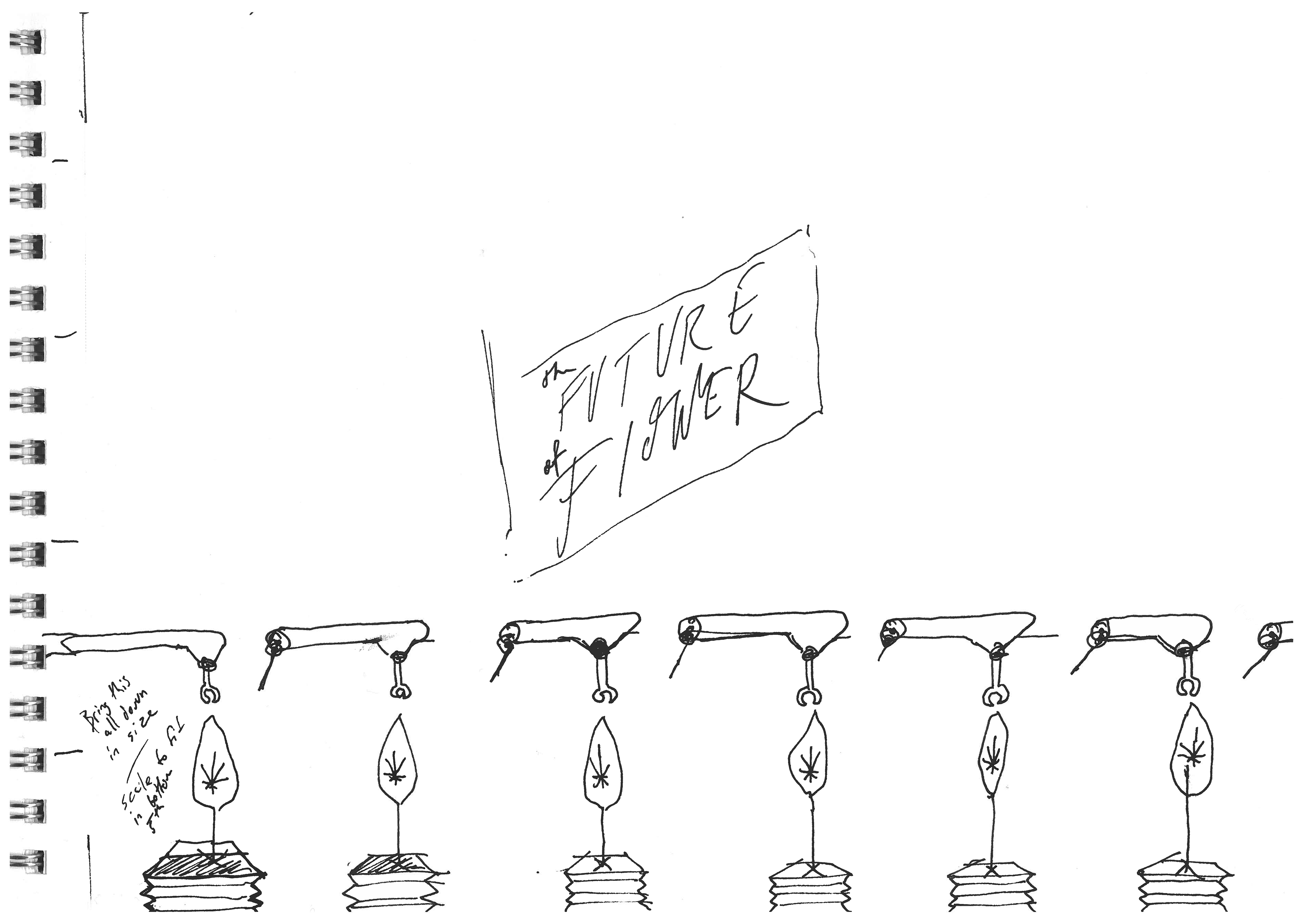
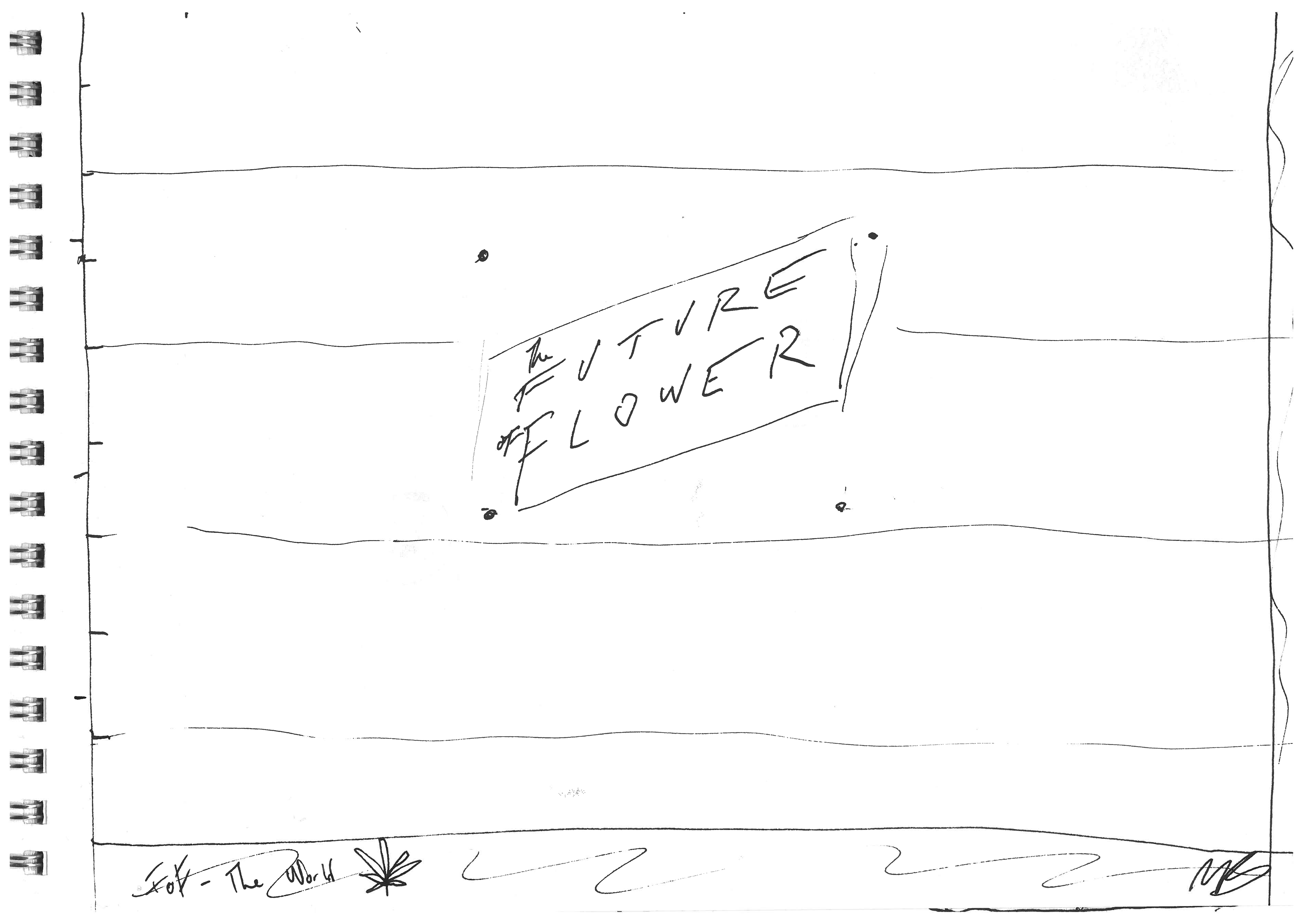
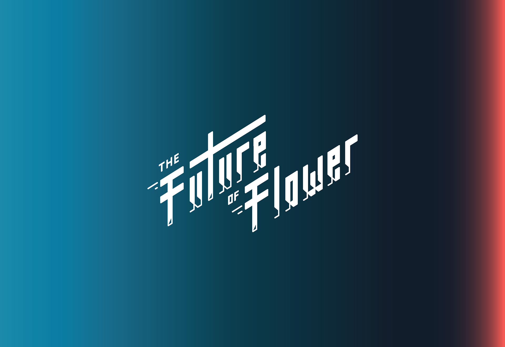
This is the Future of Flower.
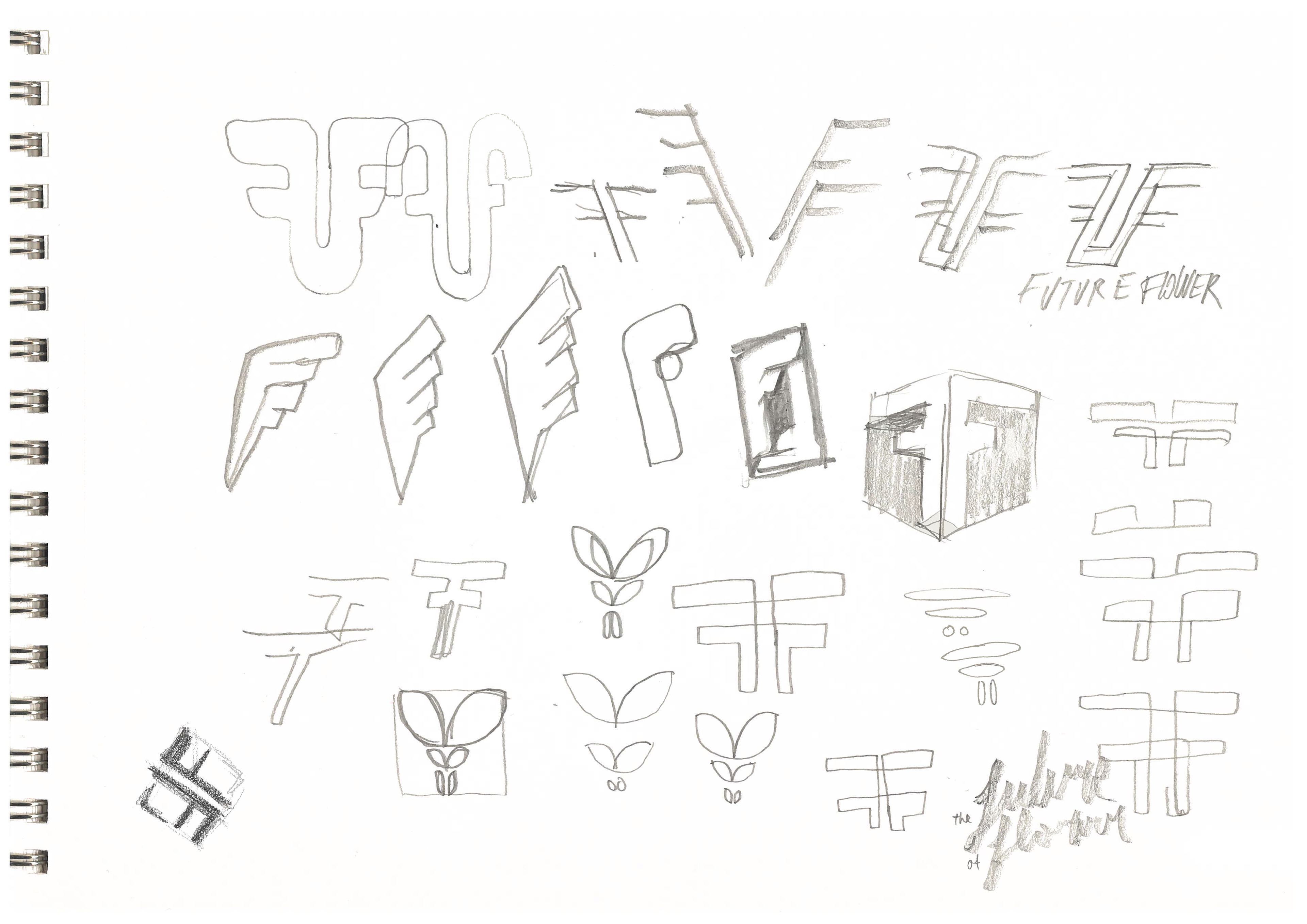
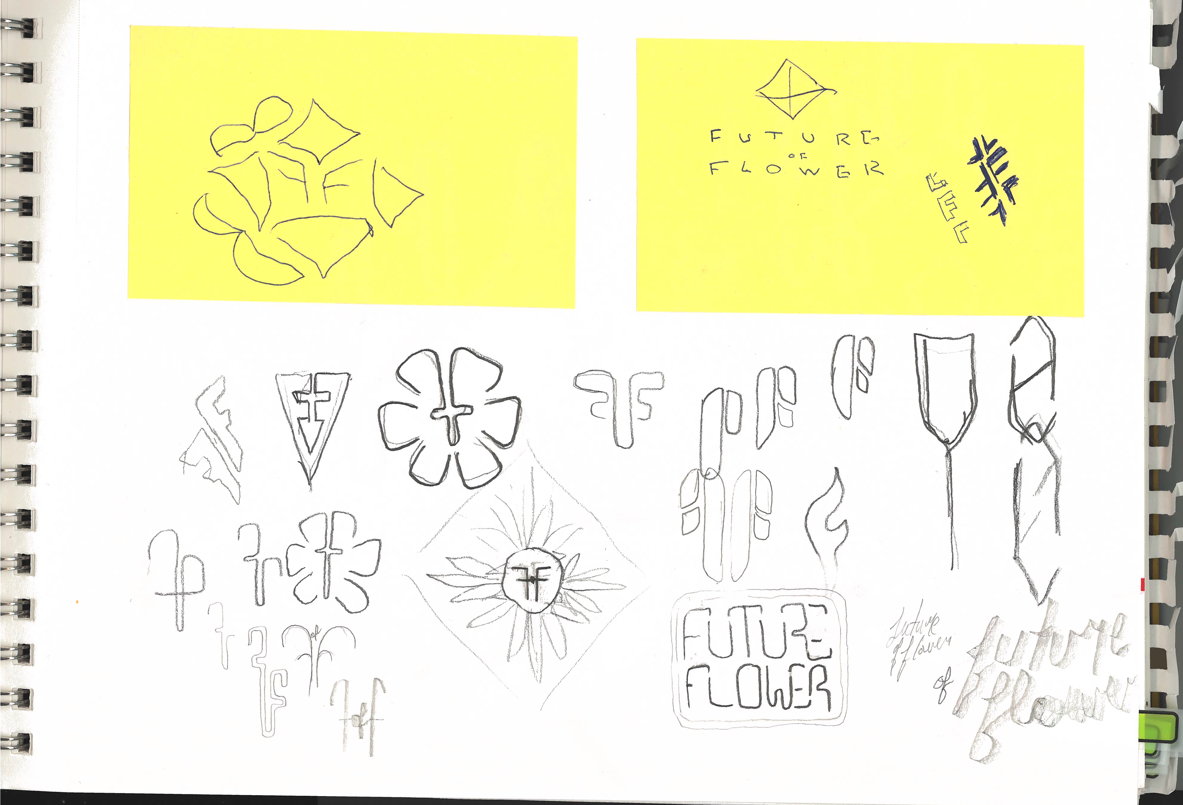
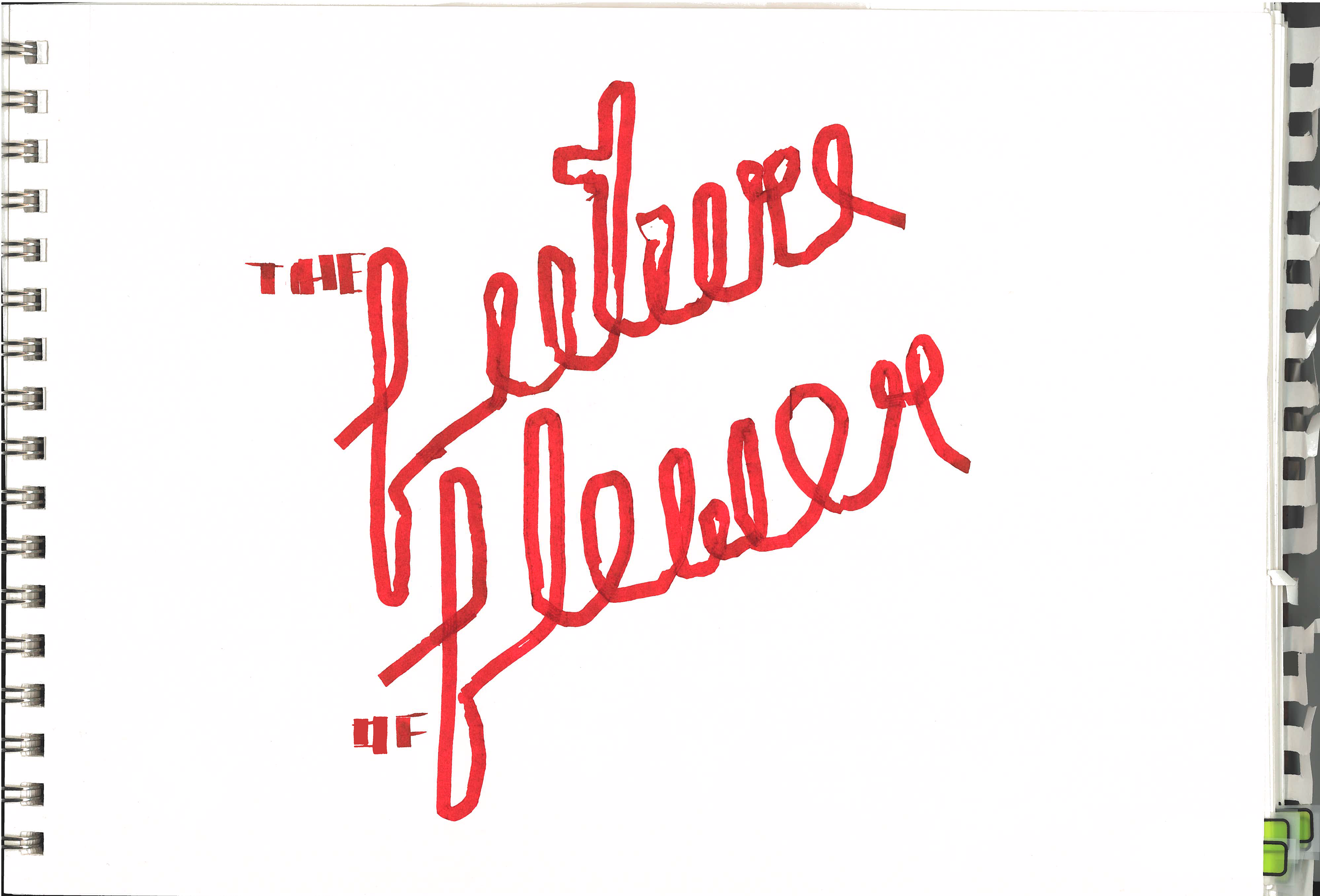
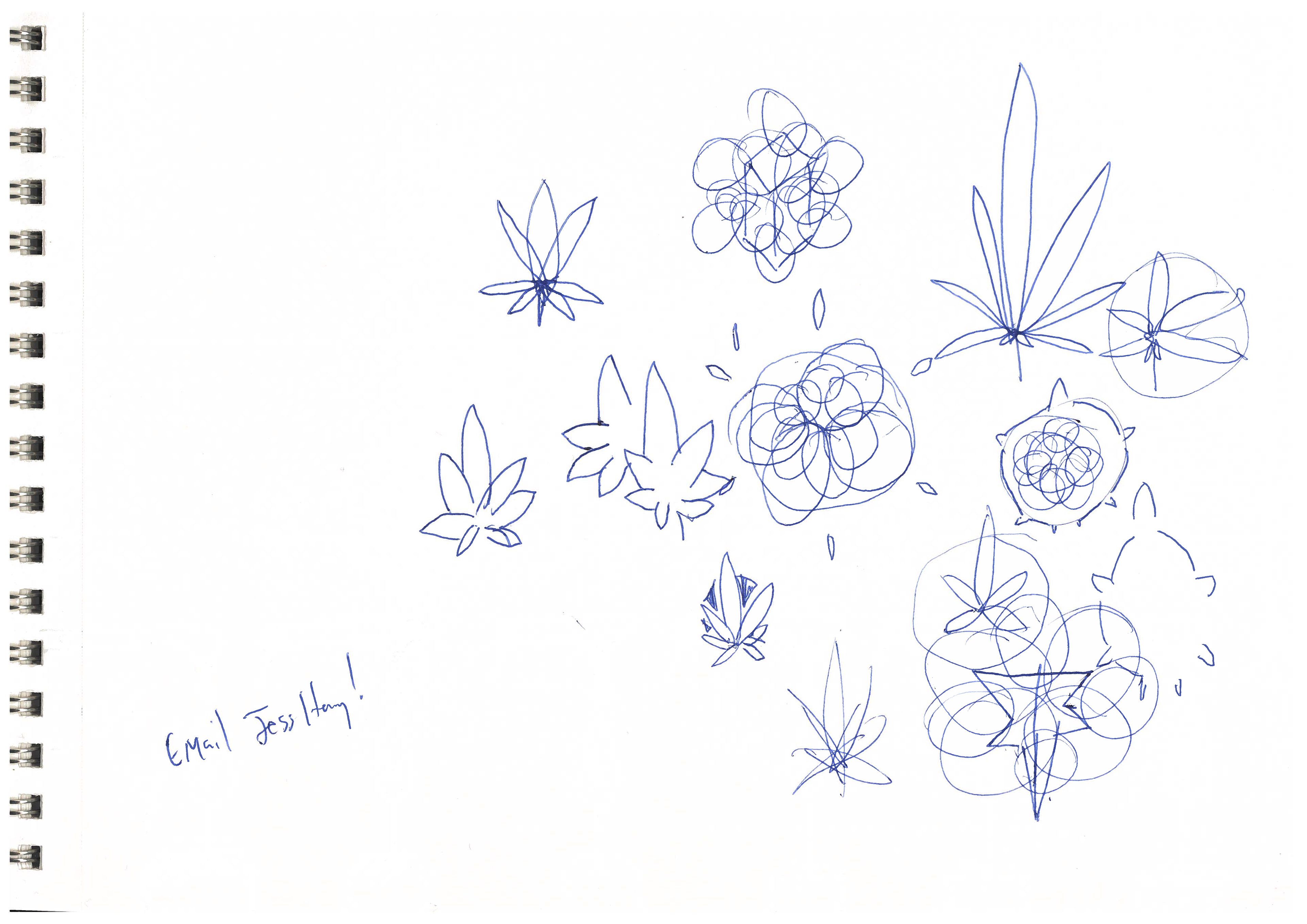
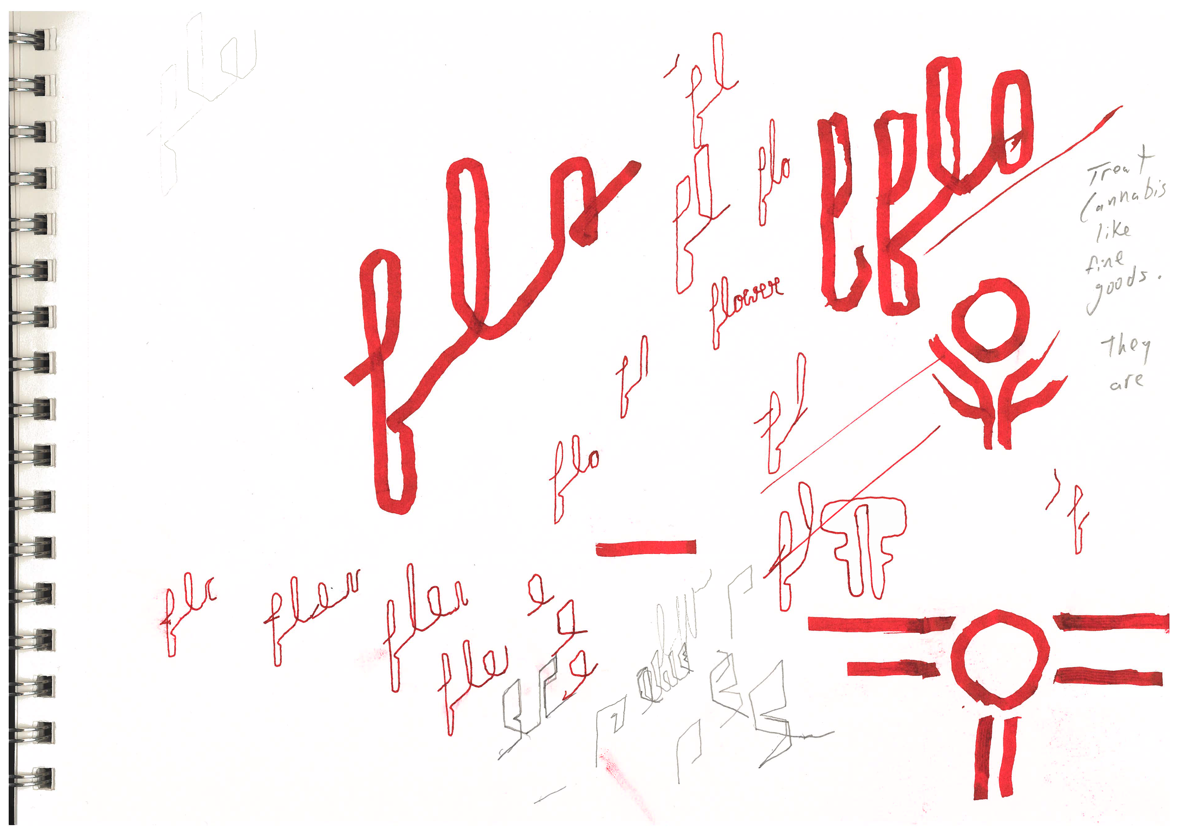
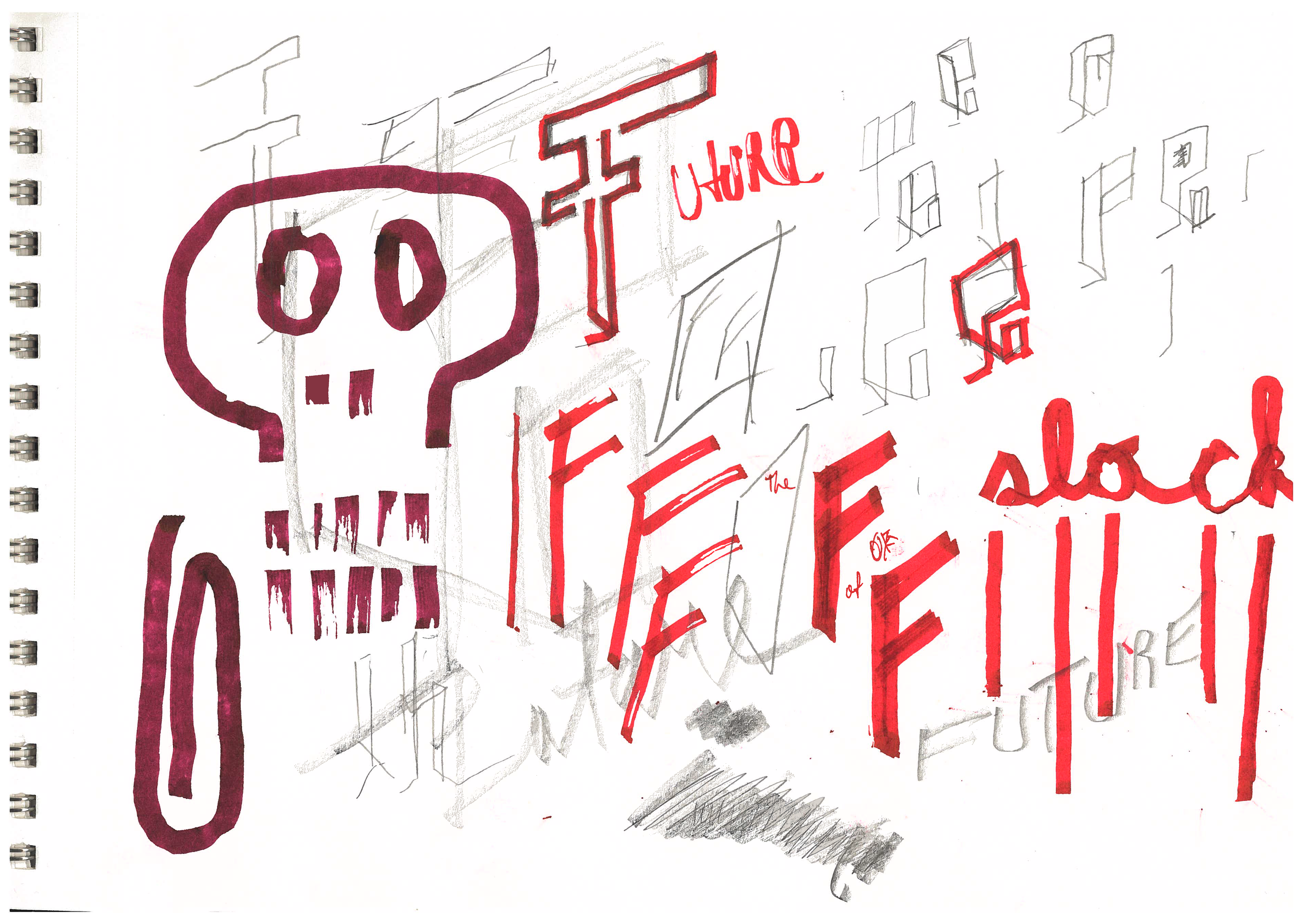
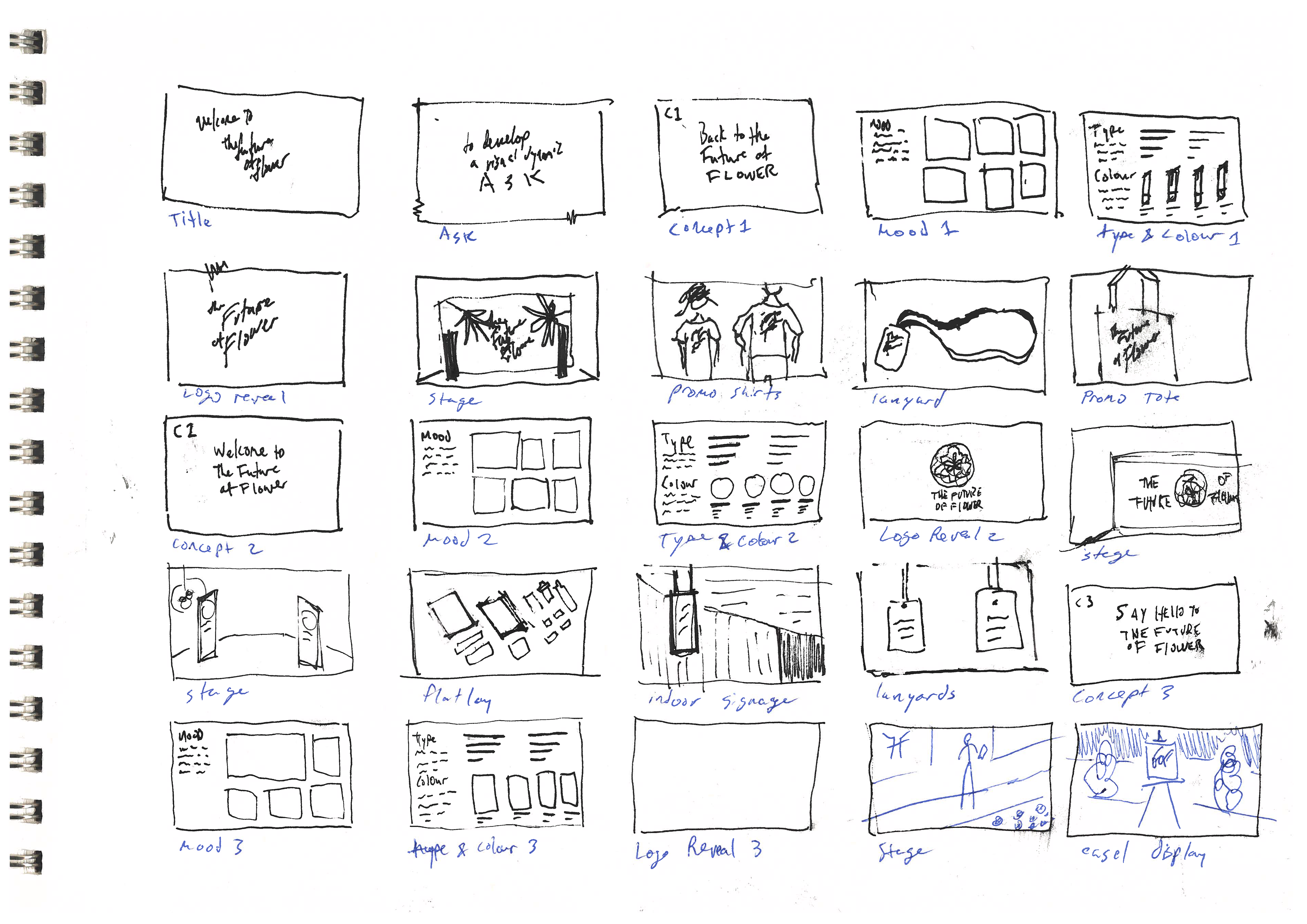
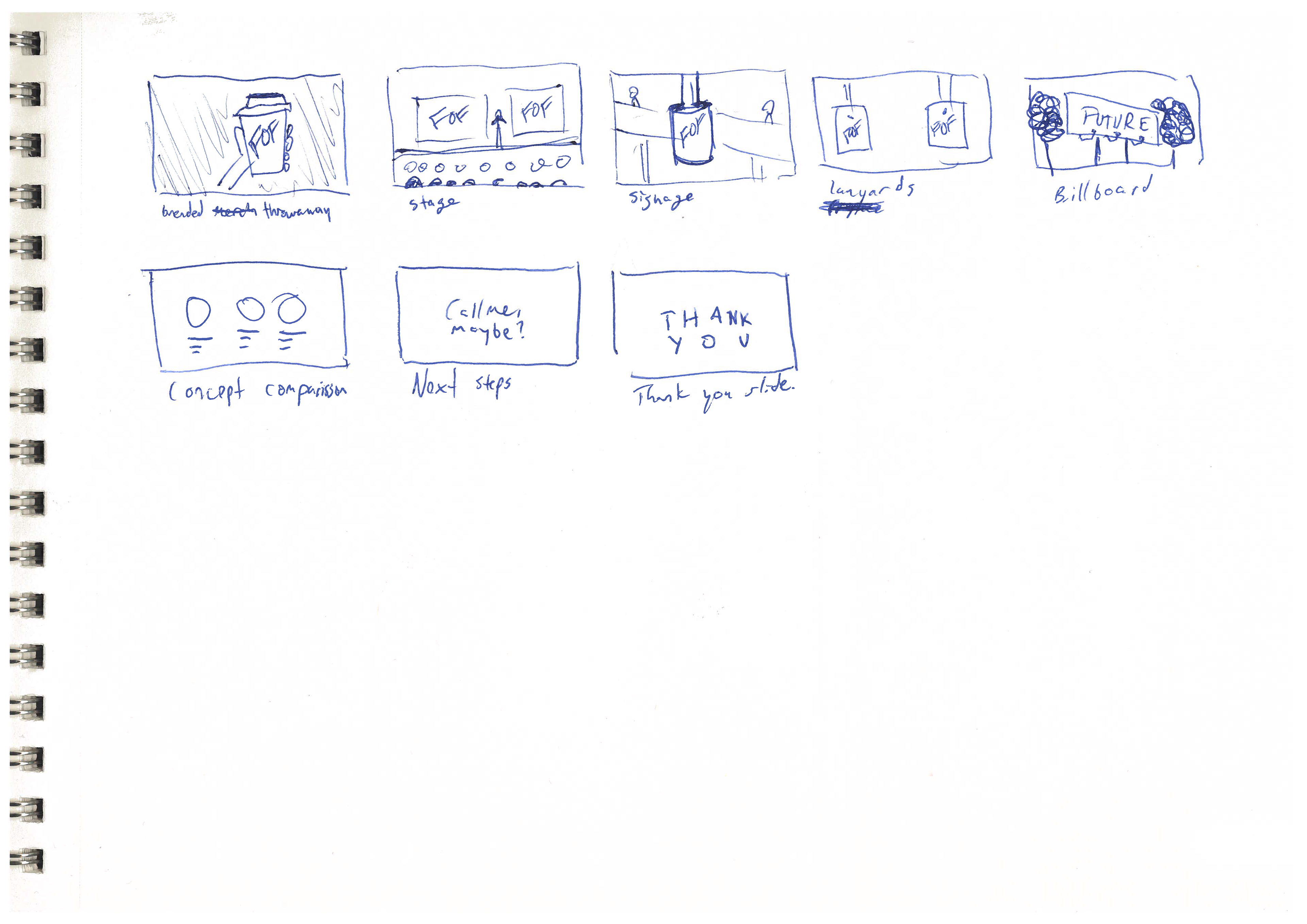
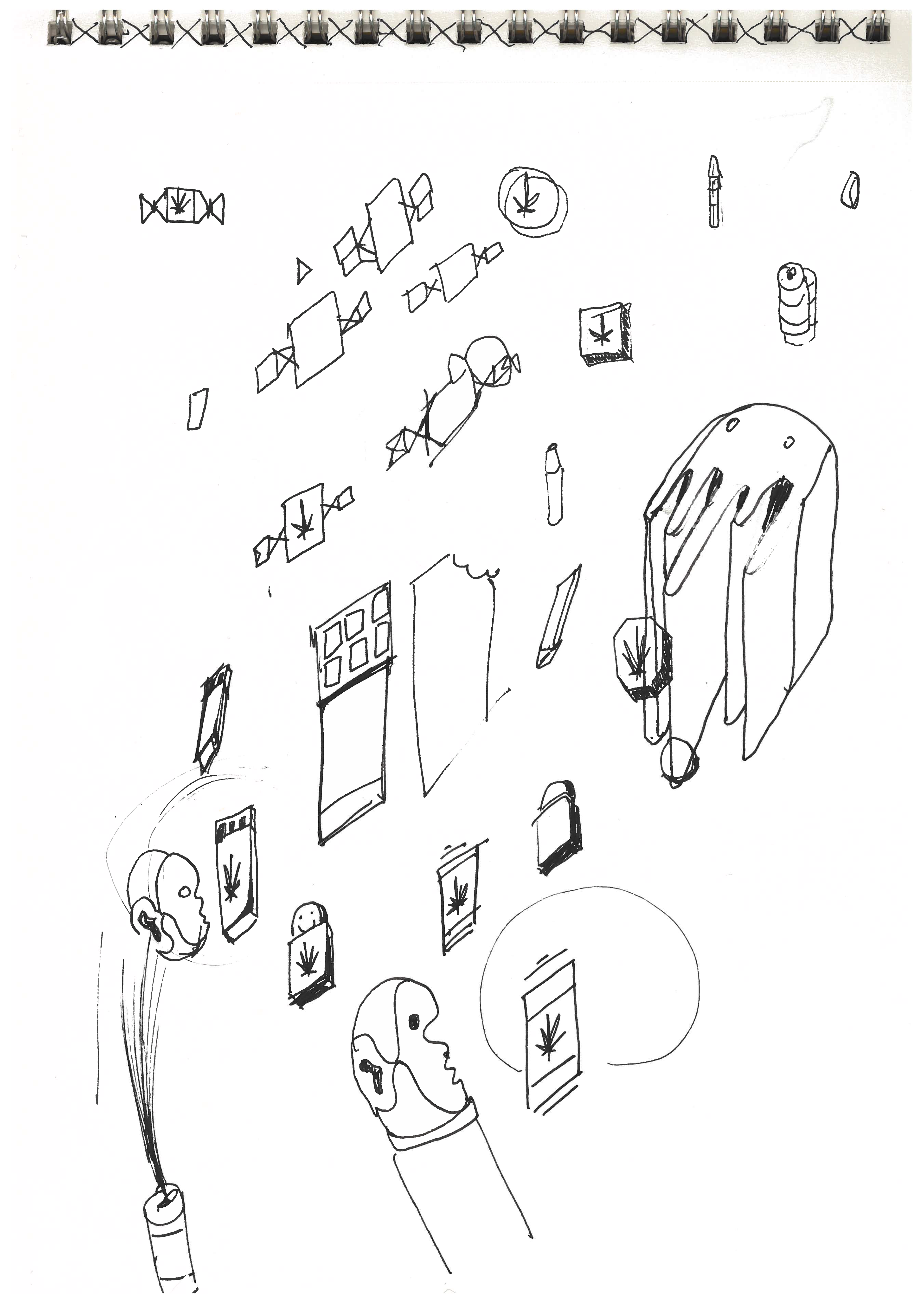
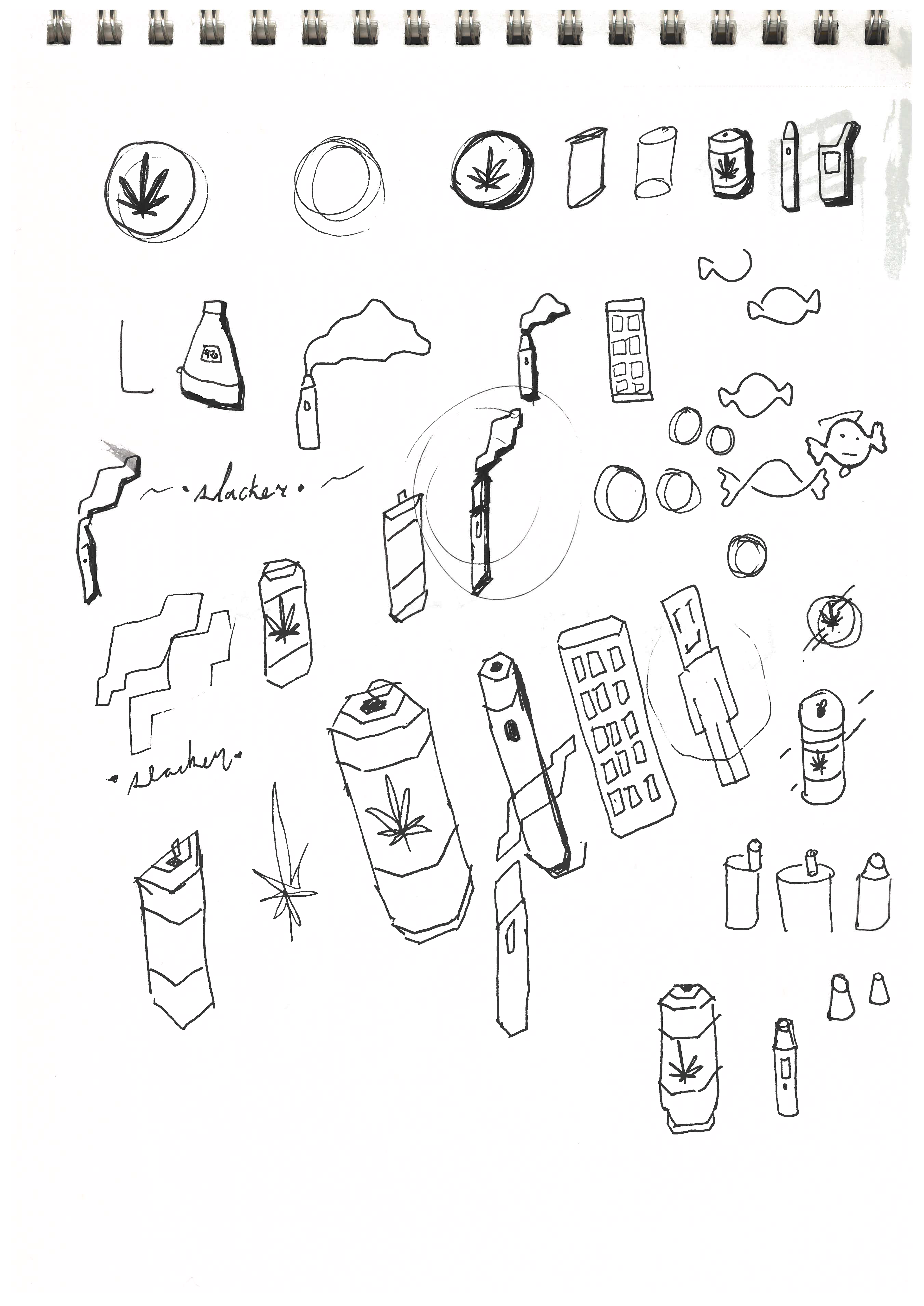
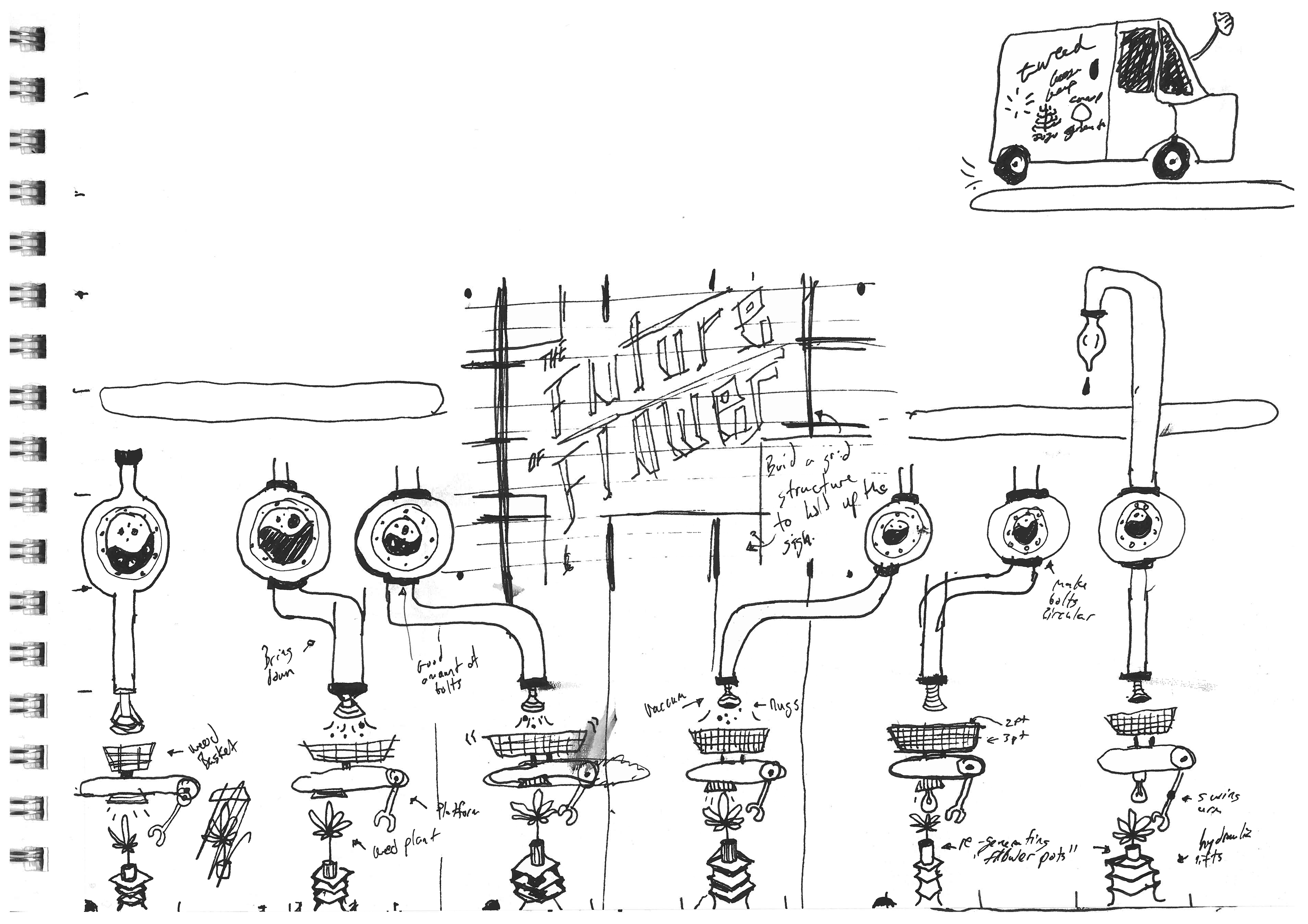
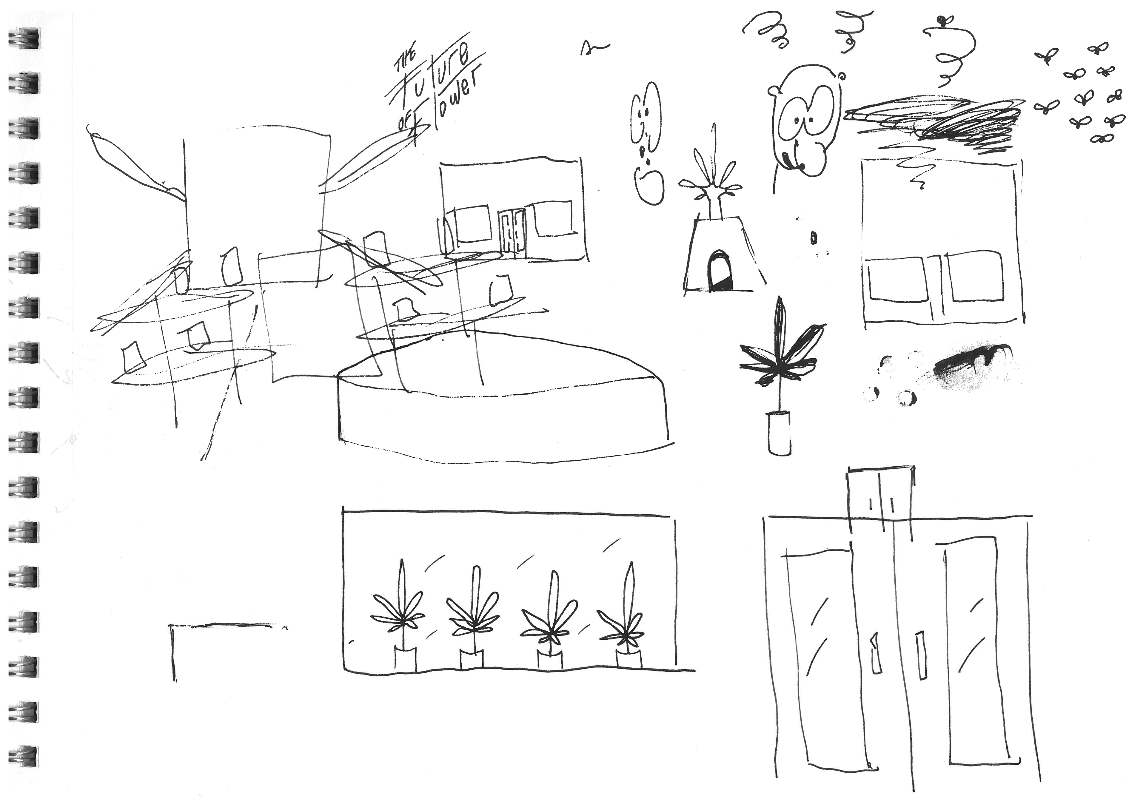
The ask was to develop an identity for a conference that was intended to excite, motivate, inform, and educate. The Future of Flower was Canopy’s 2019 sales conference for its entire company, with legalization 2.0 right around the corner, they had a lot of exciting information to bring to the table.
As the lead designer on this project, after the kickoff with Canopy’s team, I got to work researching, strategizing and preparing for the first of many approval checkpoints. I worked with art and creative directors (Kyle Skinner, Jamie Smith, Chelle Lorenzen, Taralyn Carver, and Jessica Hay), writers (Joanne Gallop, Adam Lalama, and Meagan Kelly), marketing (Nick Skotidas), and even some unrelated departments at the company when conducting focus groups (legal, finance, development, etc.).
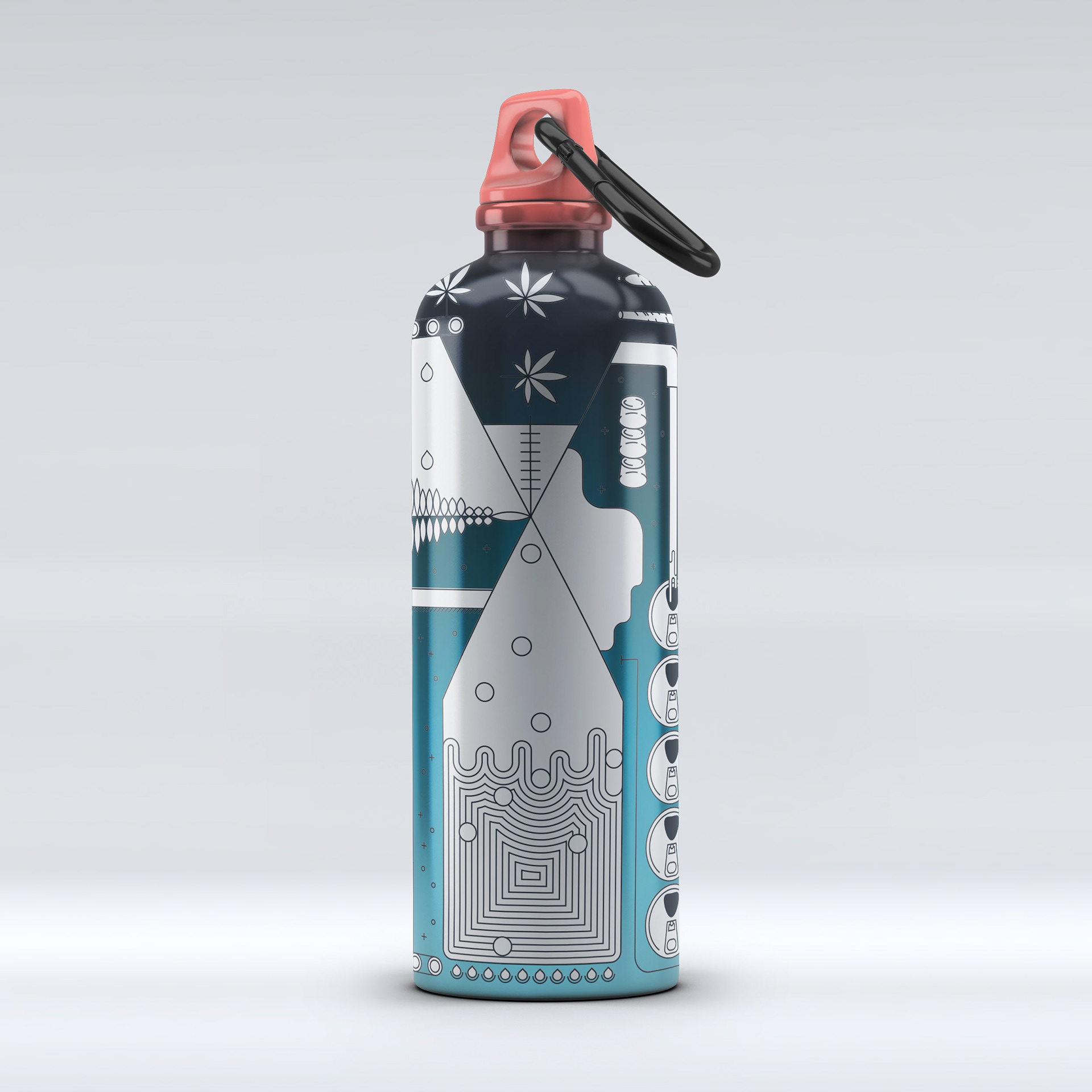
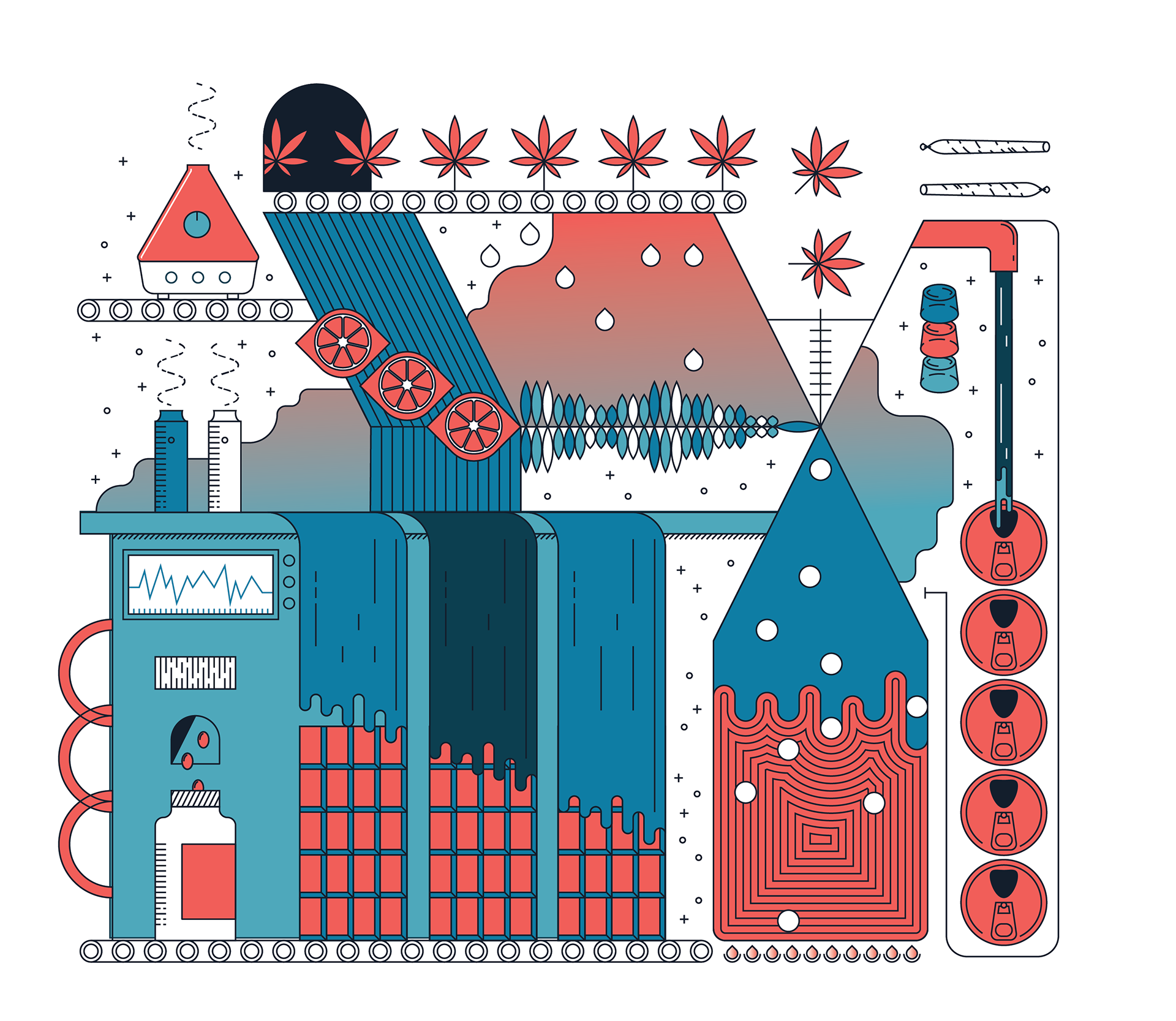
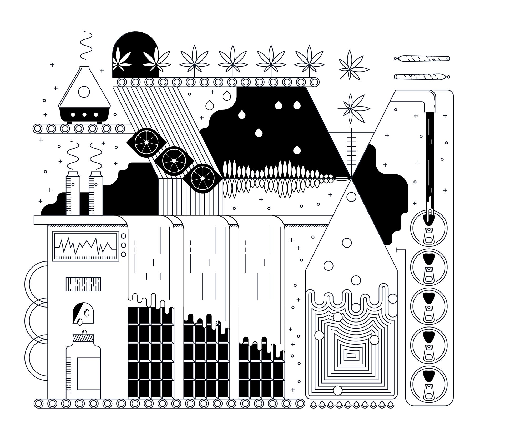
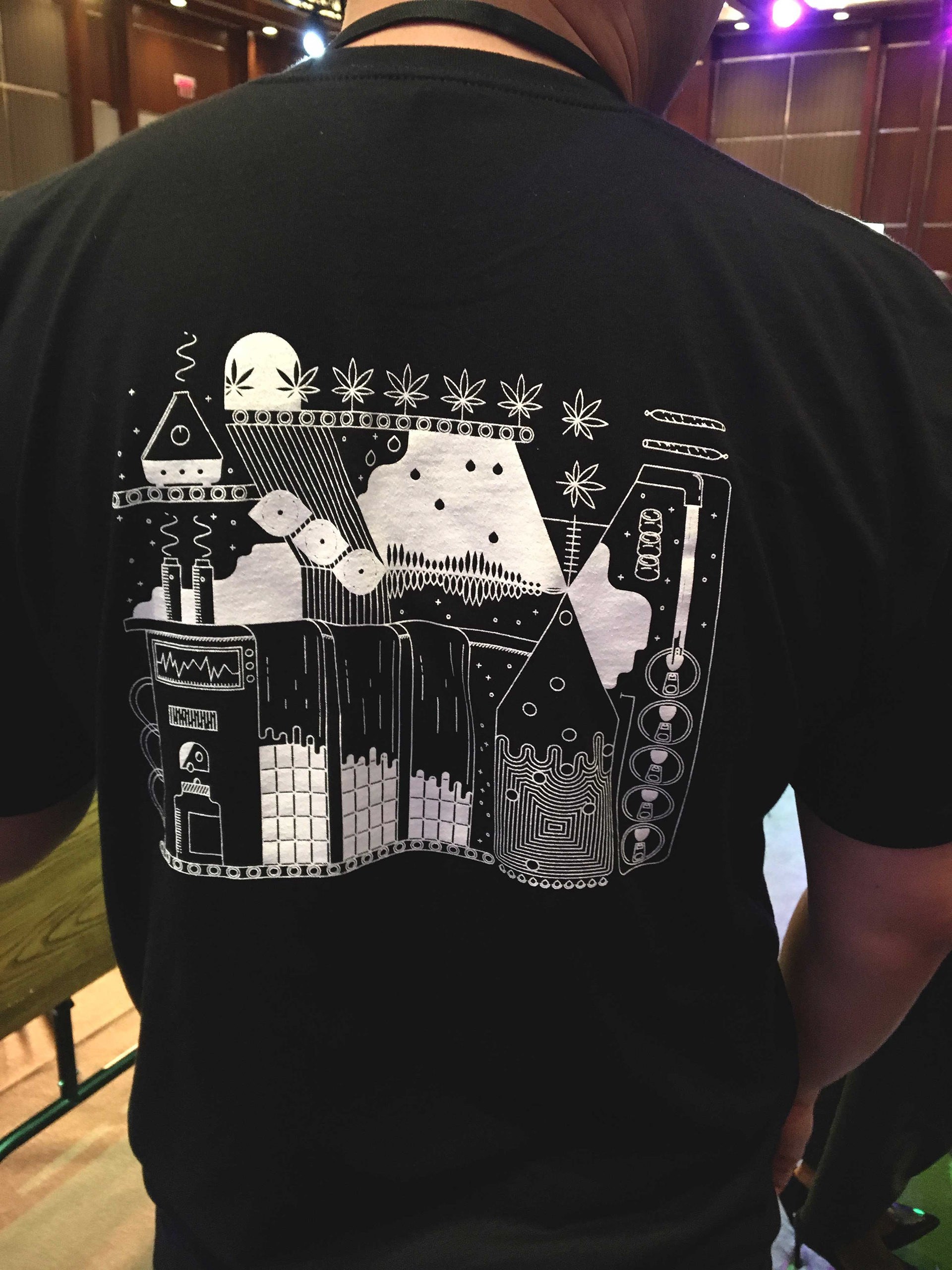
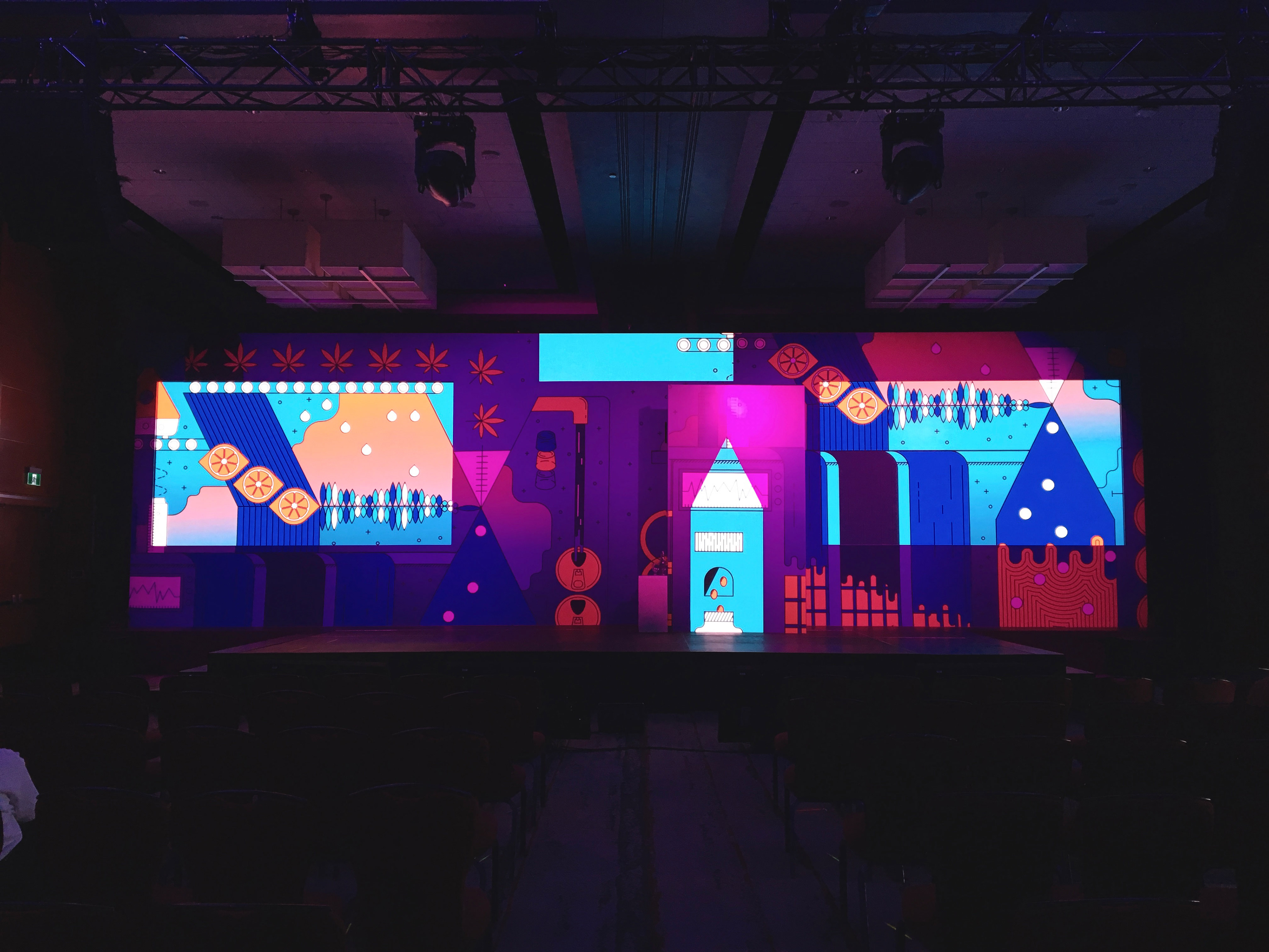
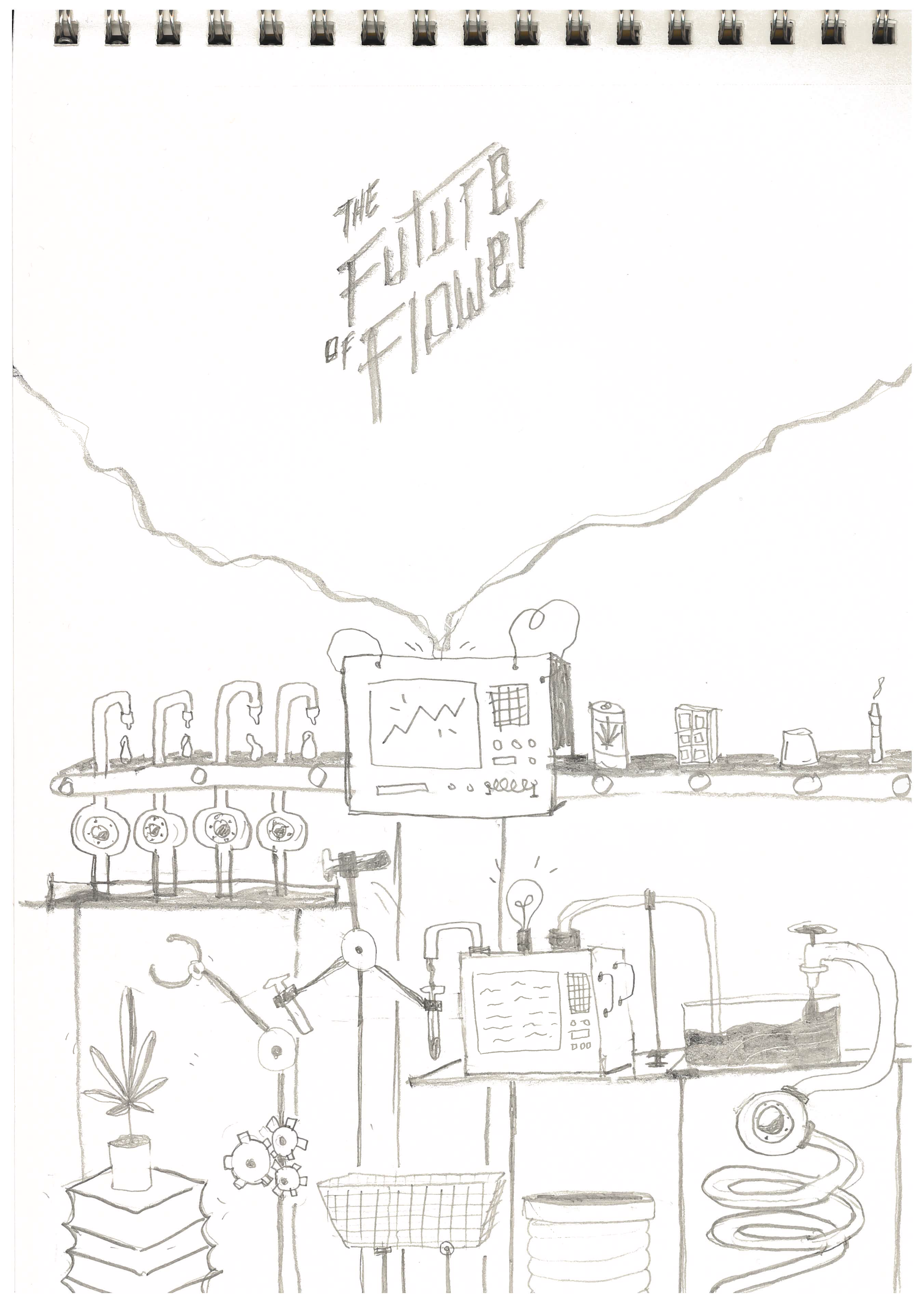
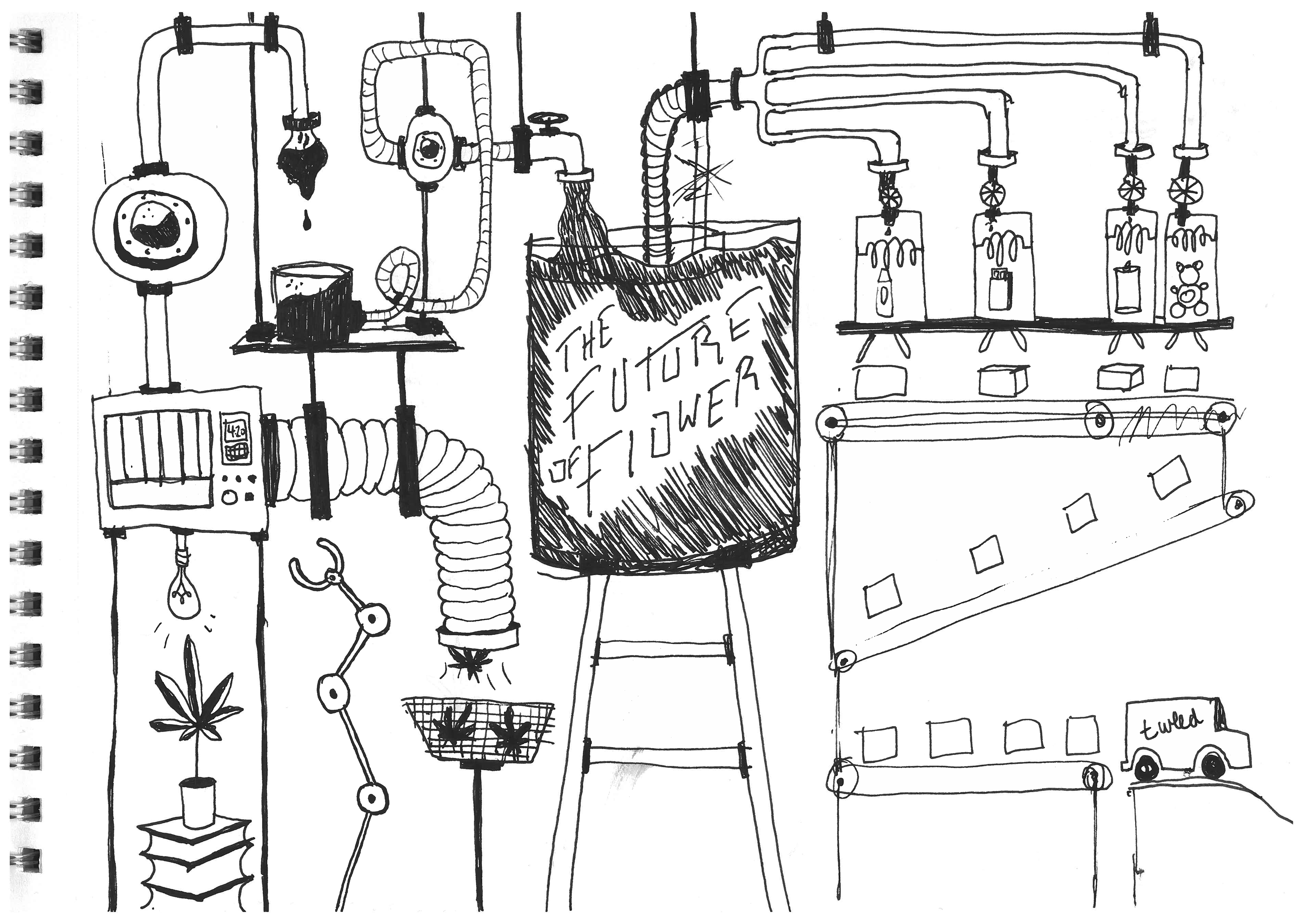
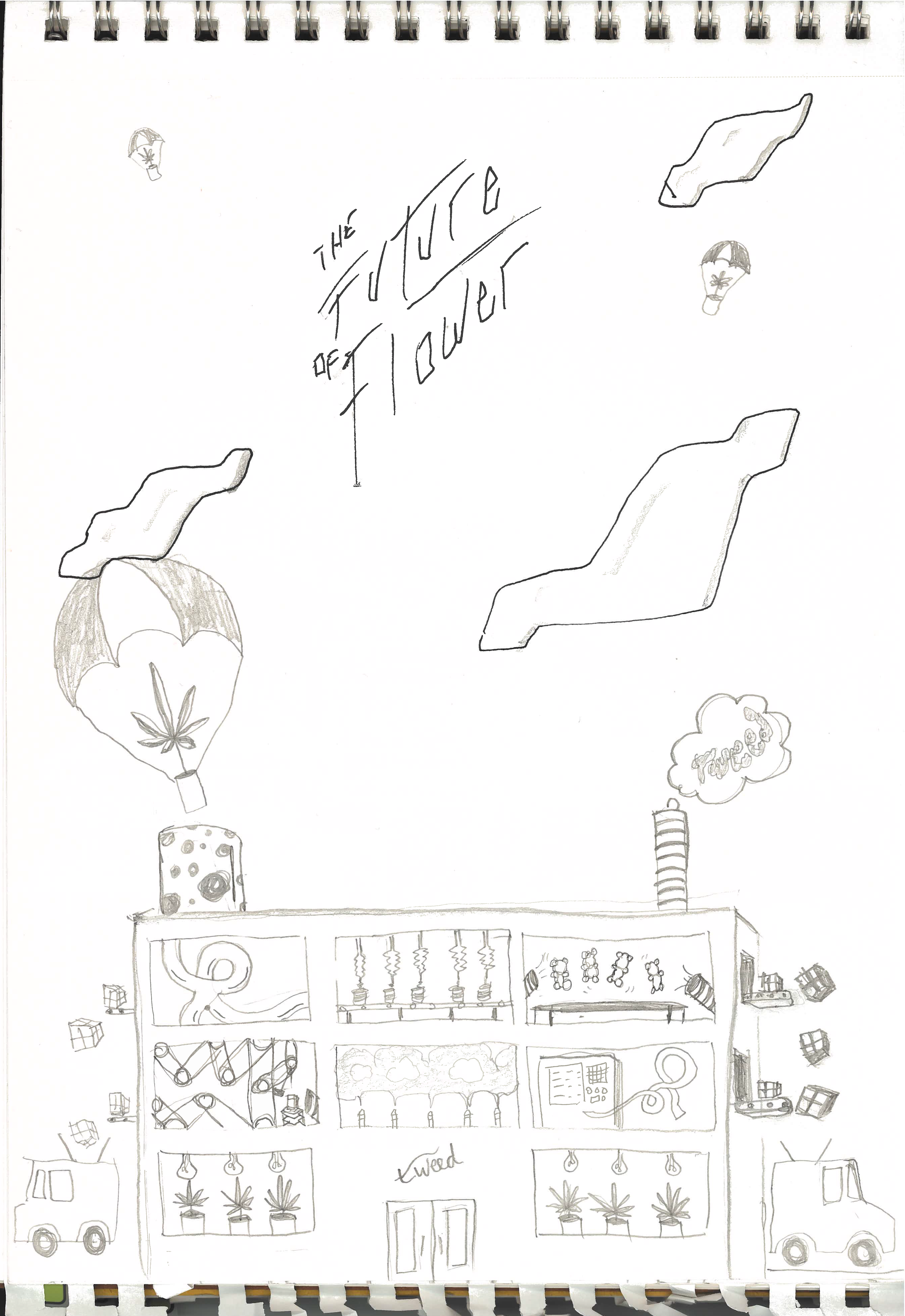
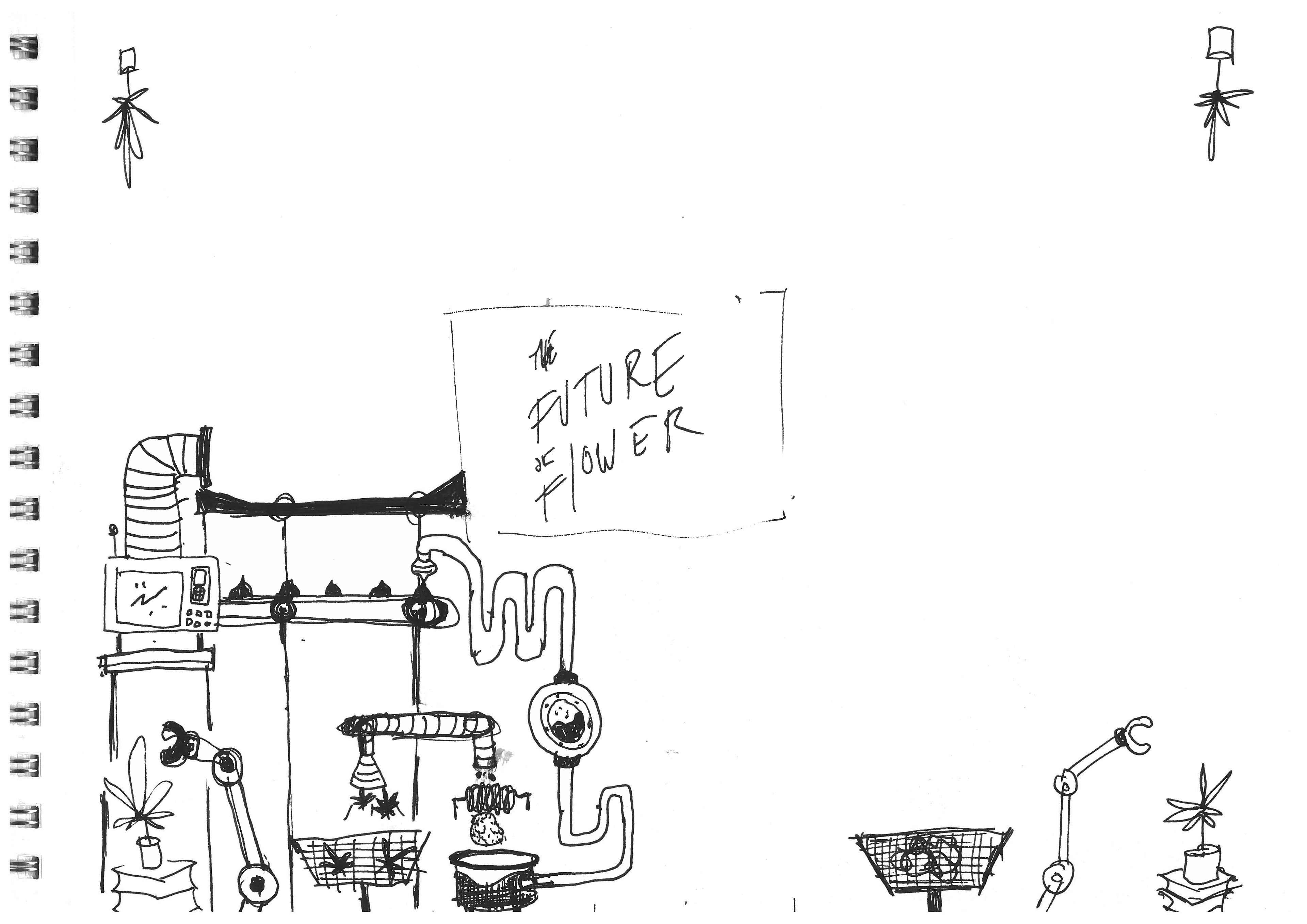
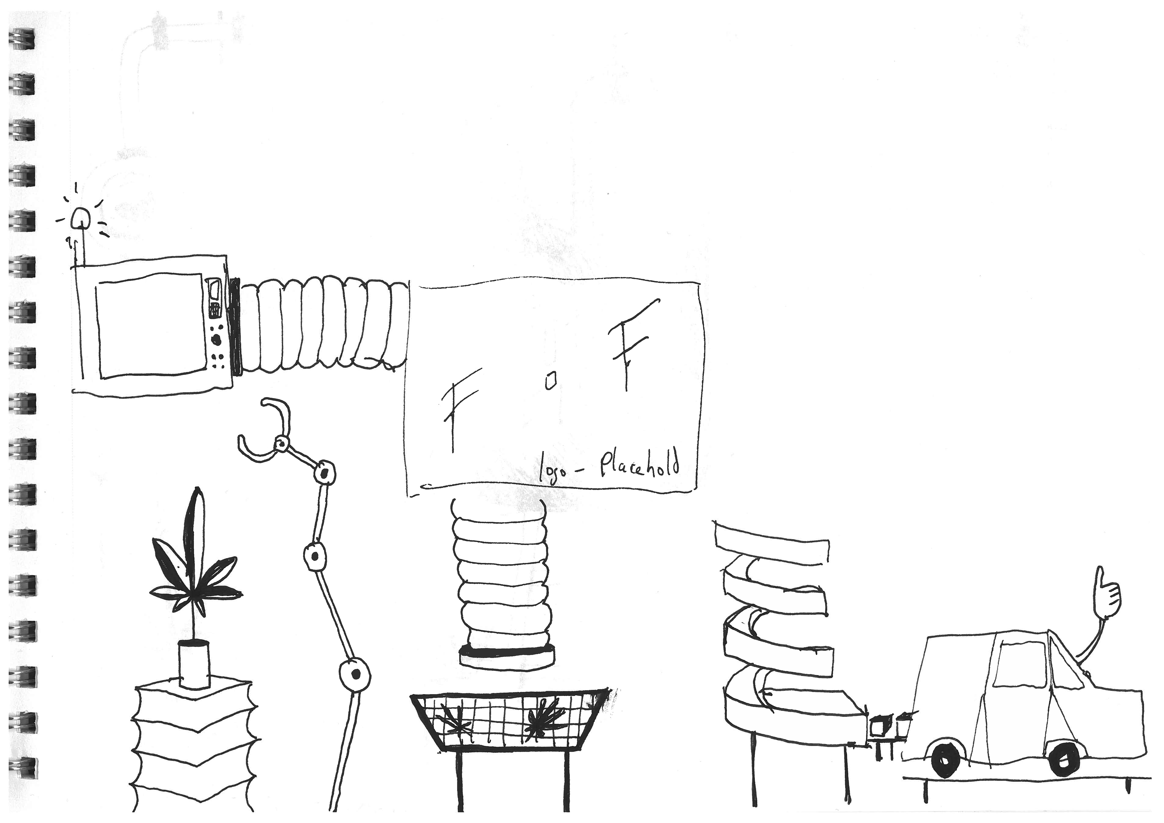
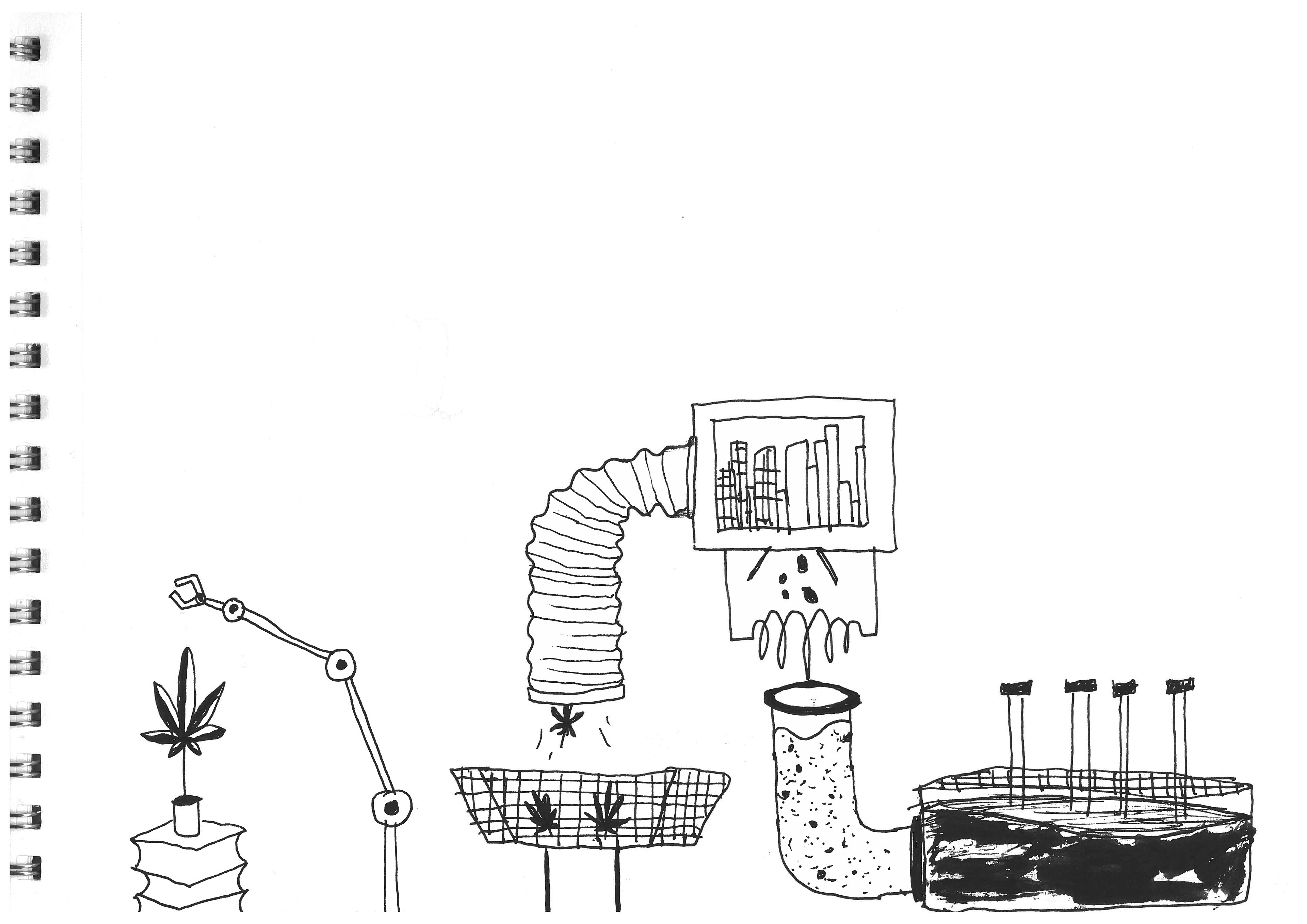
Final versions of the machine illustration (pictured above), were executed by Chelle Lorenzen.
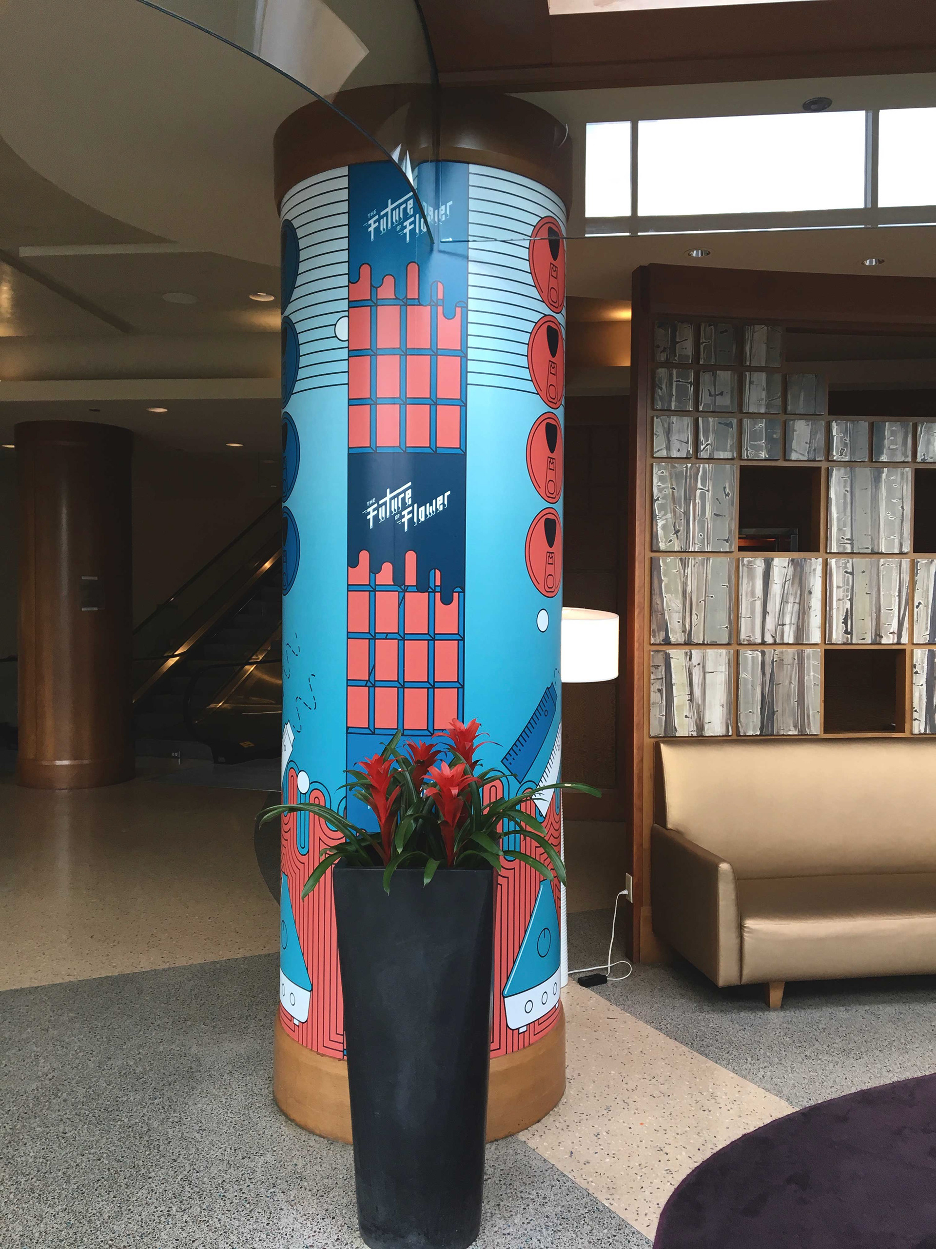
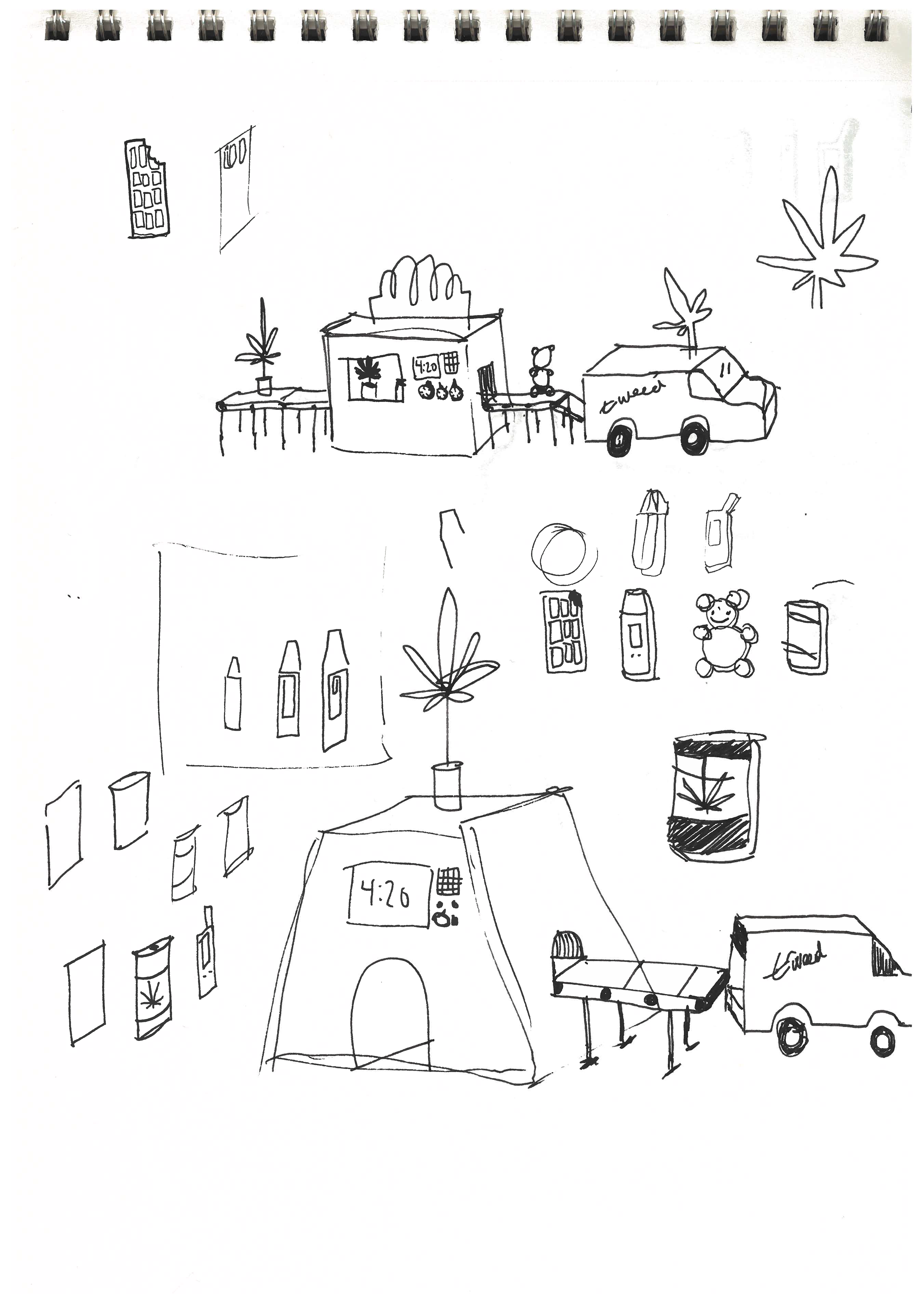
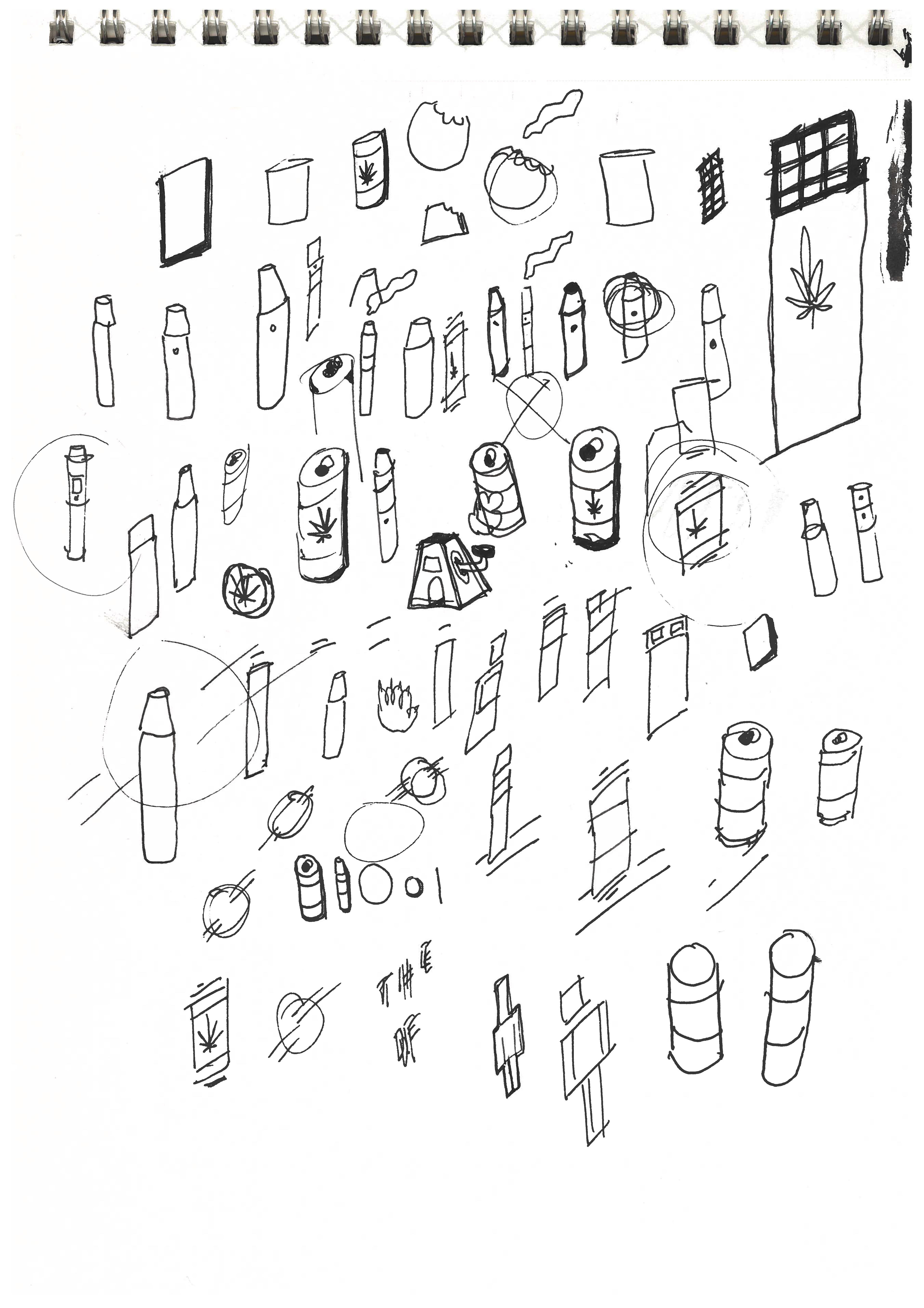
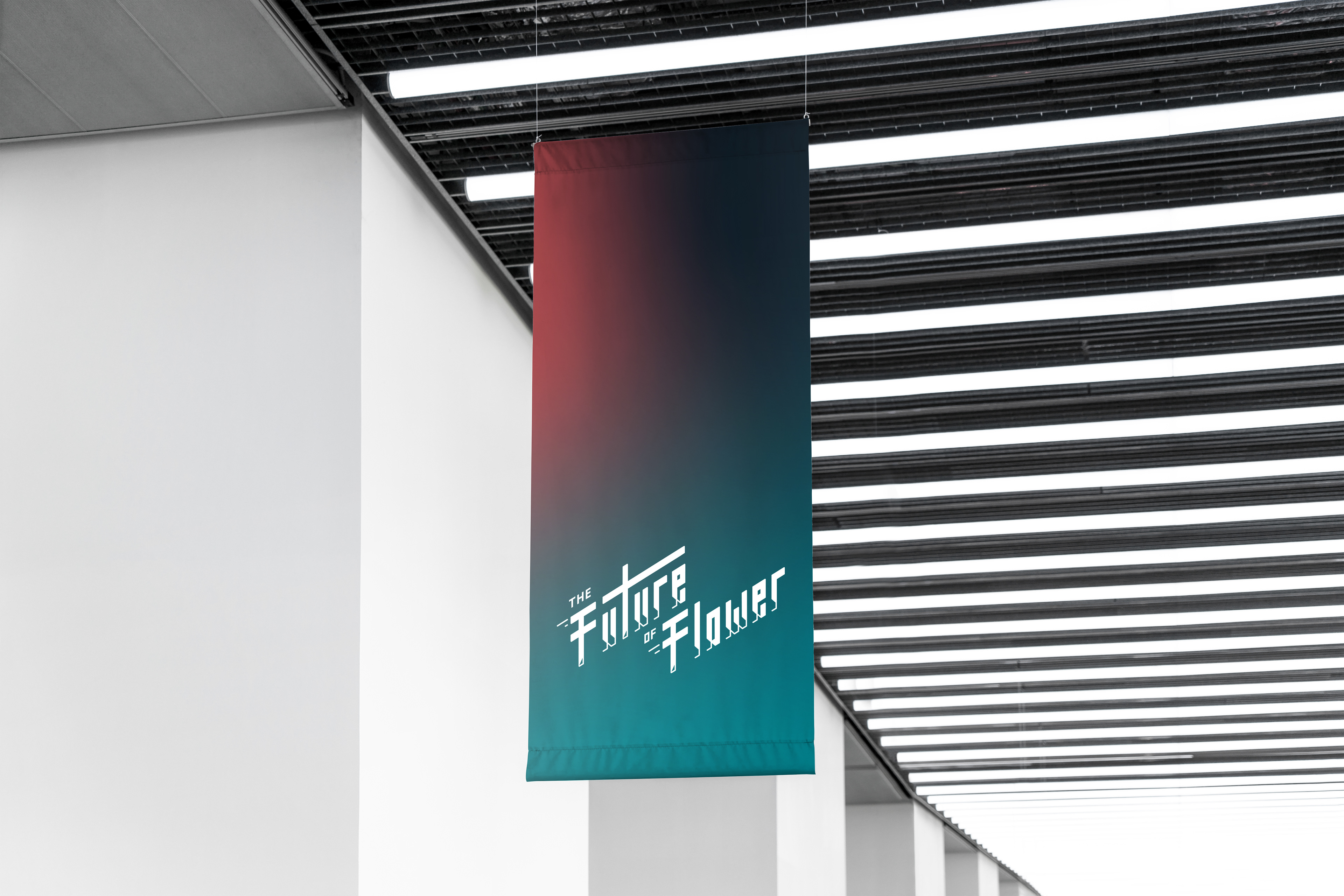
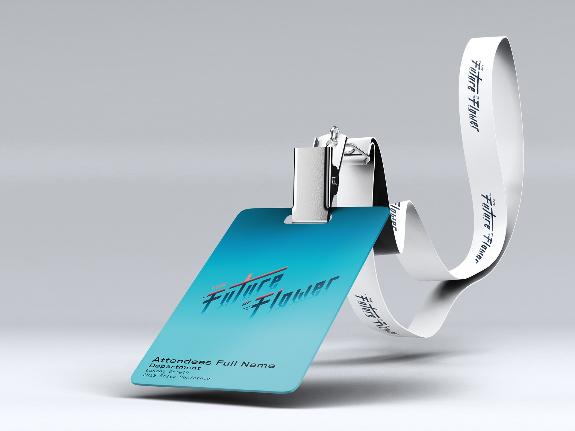
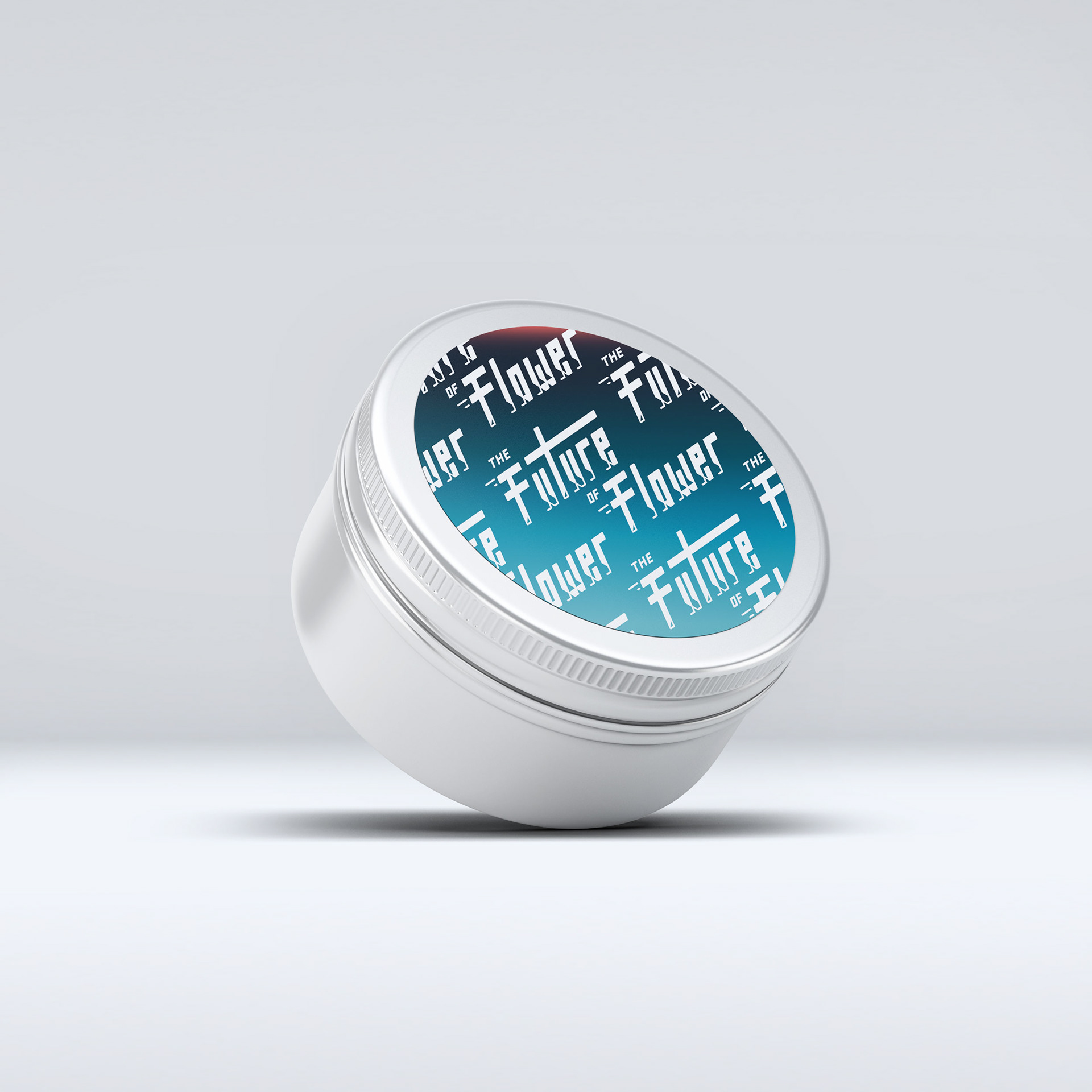
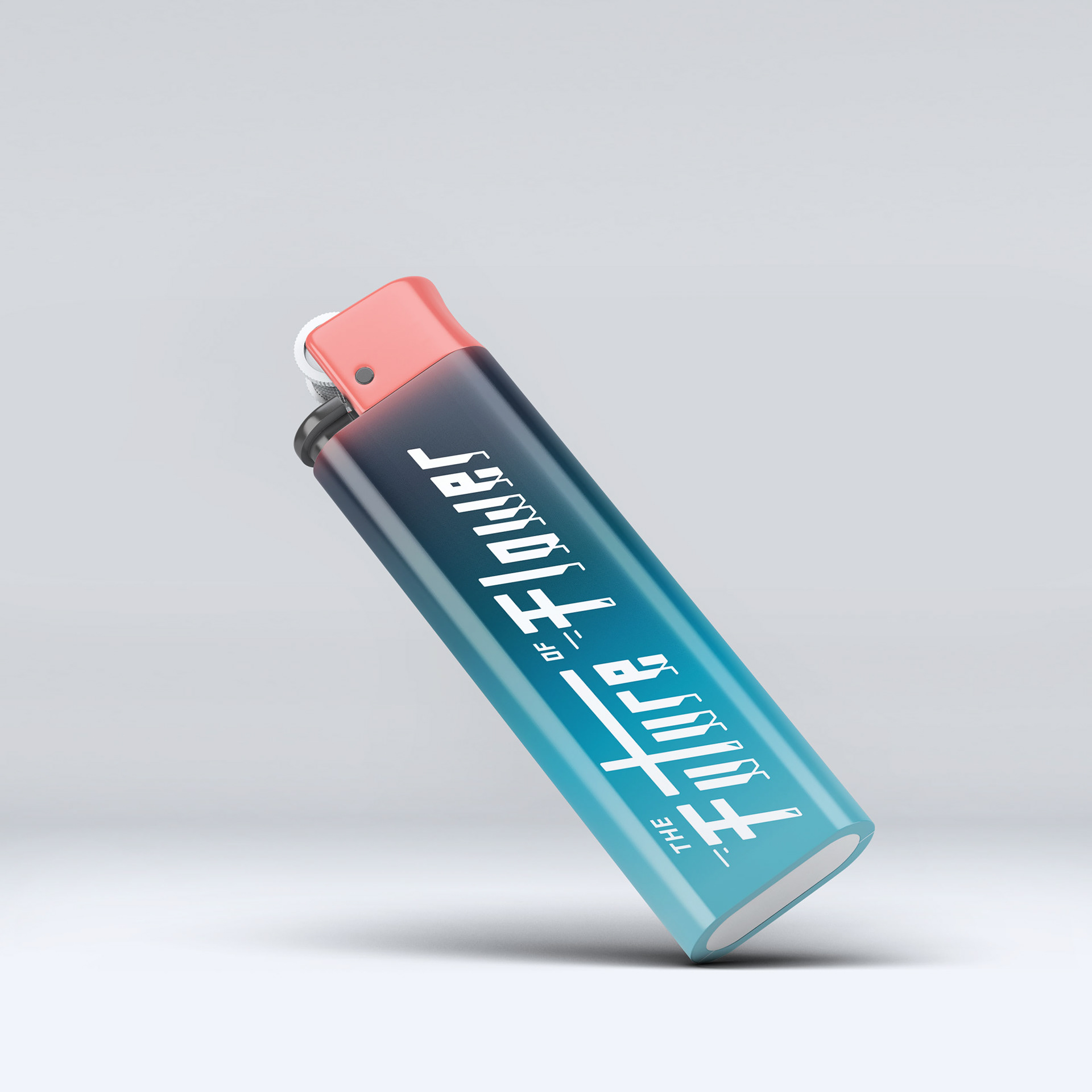
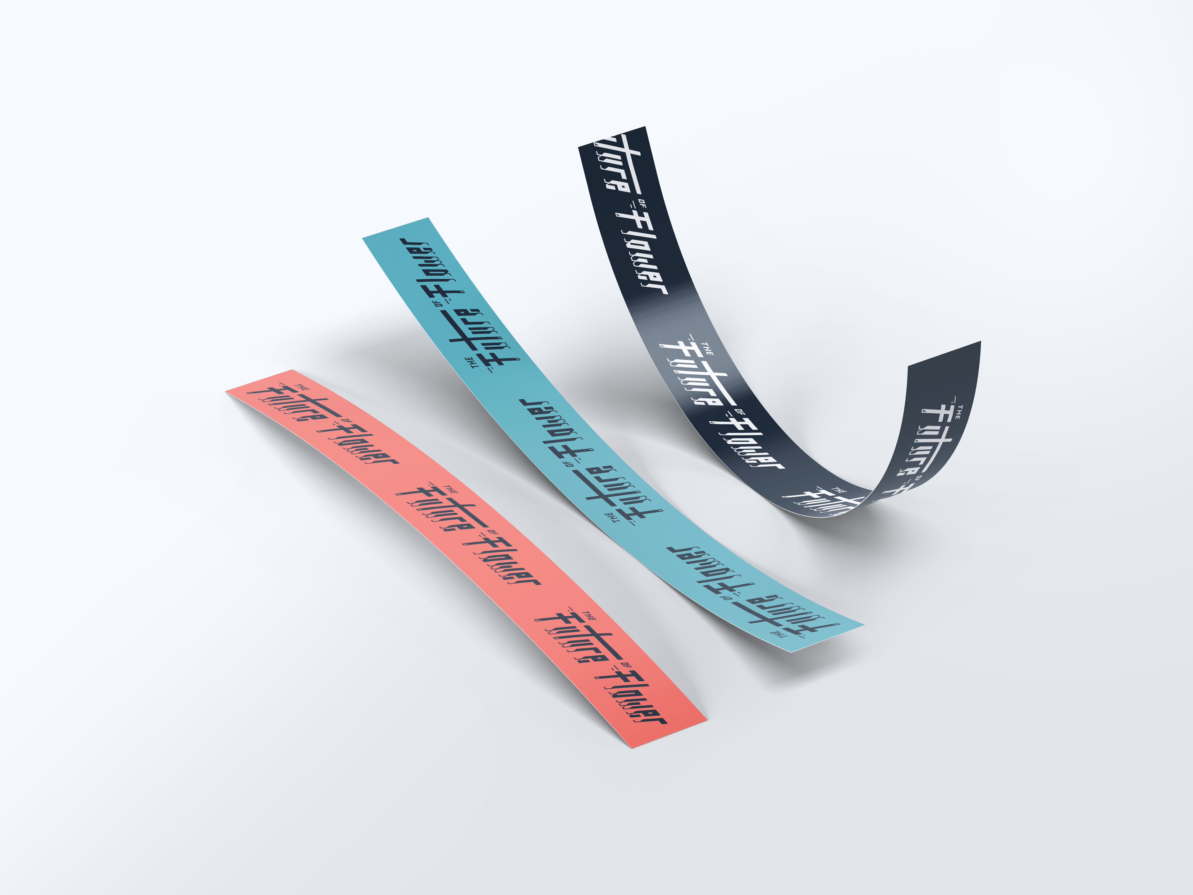
All final applications were built, applied and executed by the amazing design team at Canopy Growth Corporation.