Chaz Dean is a music artist that embodies the meaning of work smart, while also working very hard.
Originating from Nassau, Bahamas, Chaz has been carving out his own path in Canada for some time now, as an artist as well as a highly regarded professional in the tech industry.
Wearing multiple hats is a big reason that this project came to be. When you are juggling multiple endeavours, you find ways to streamline processes to ensure unified success.
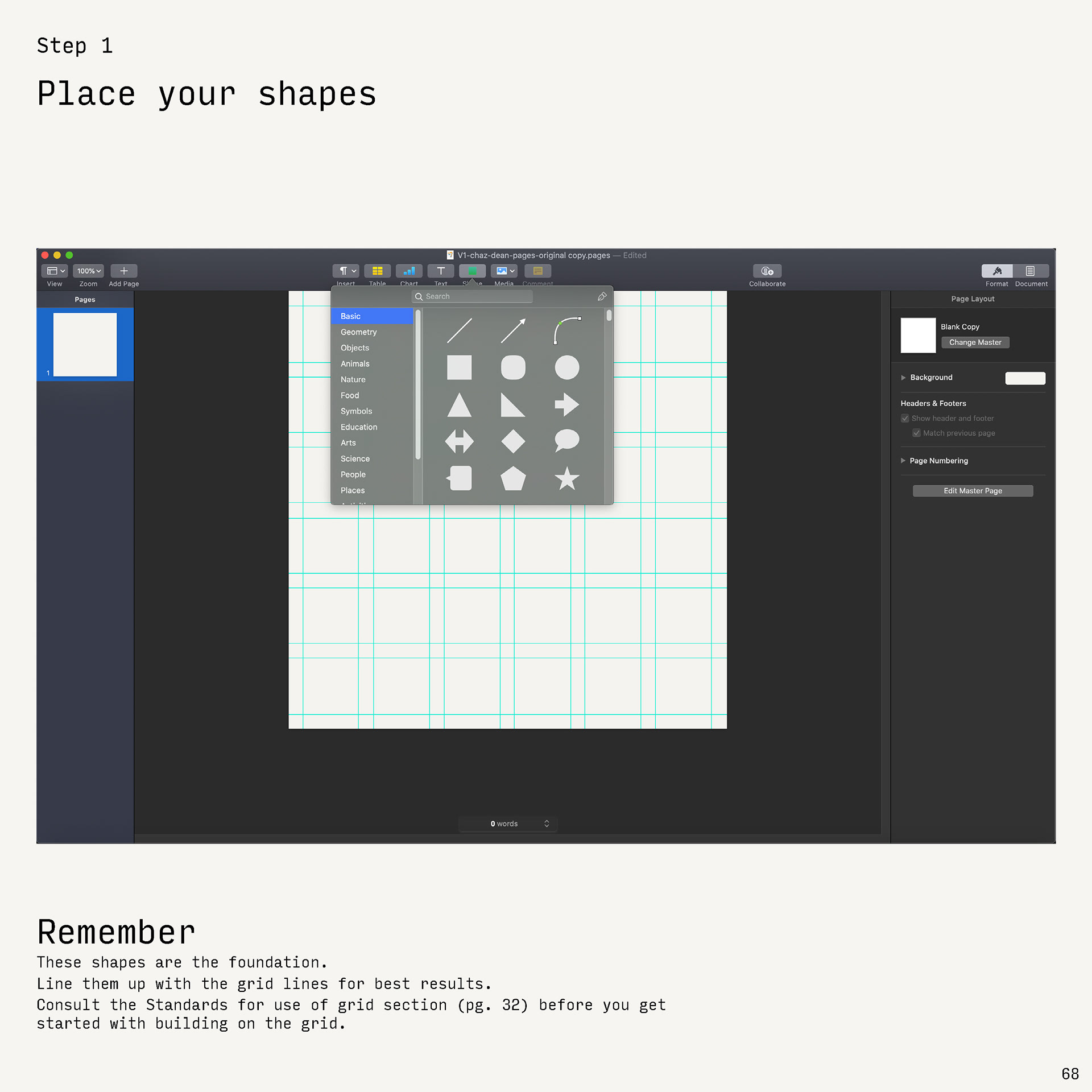
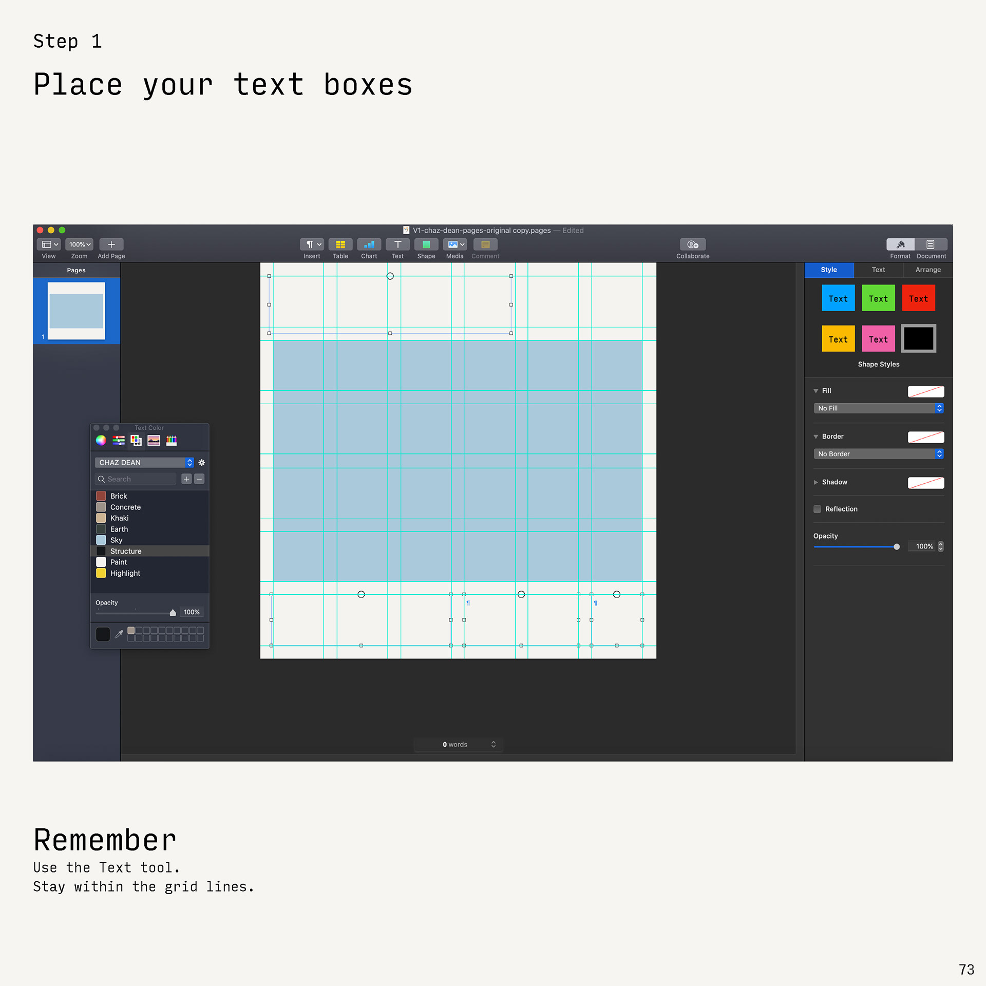
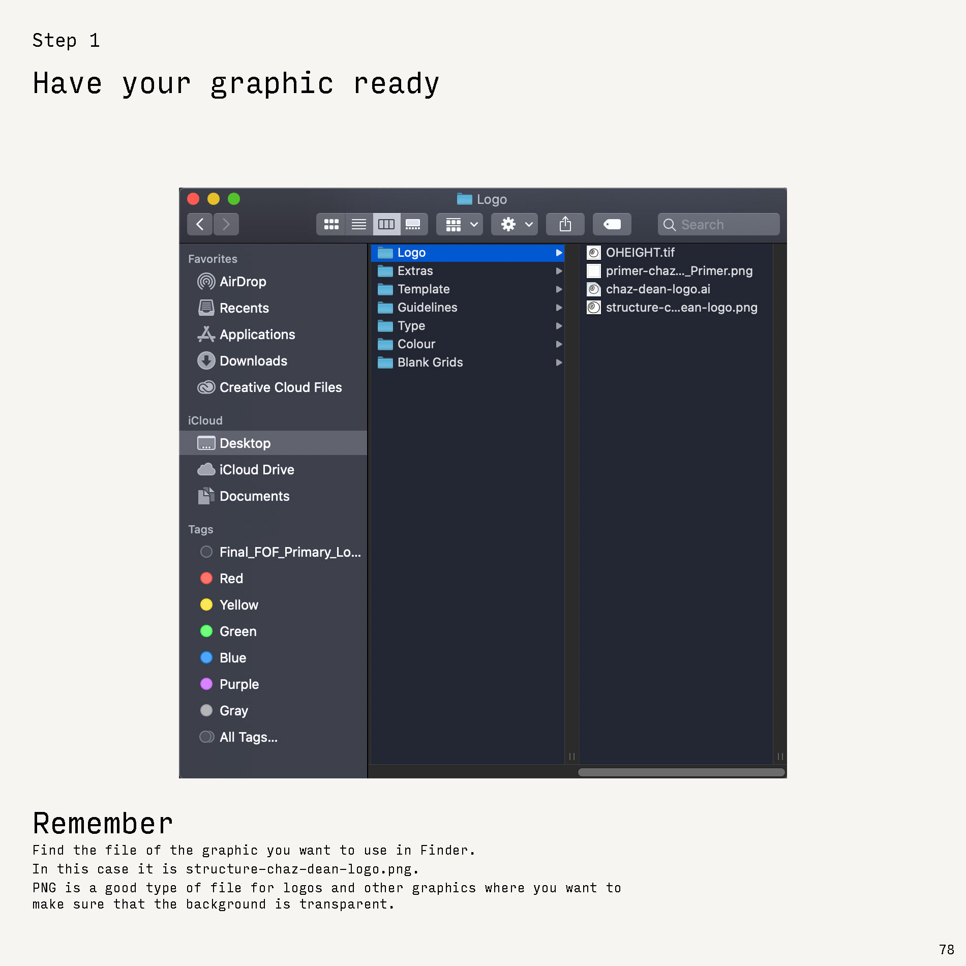
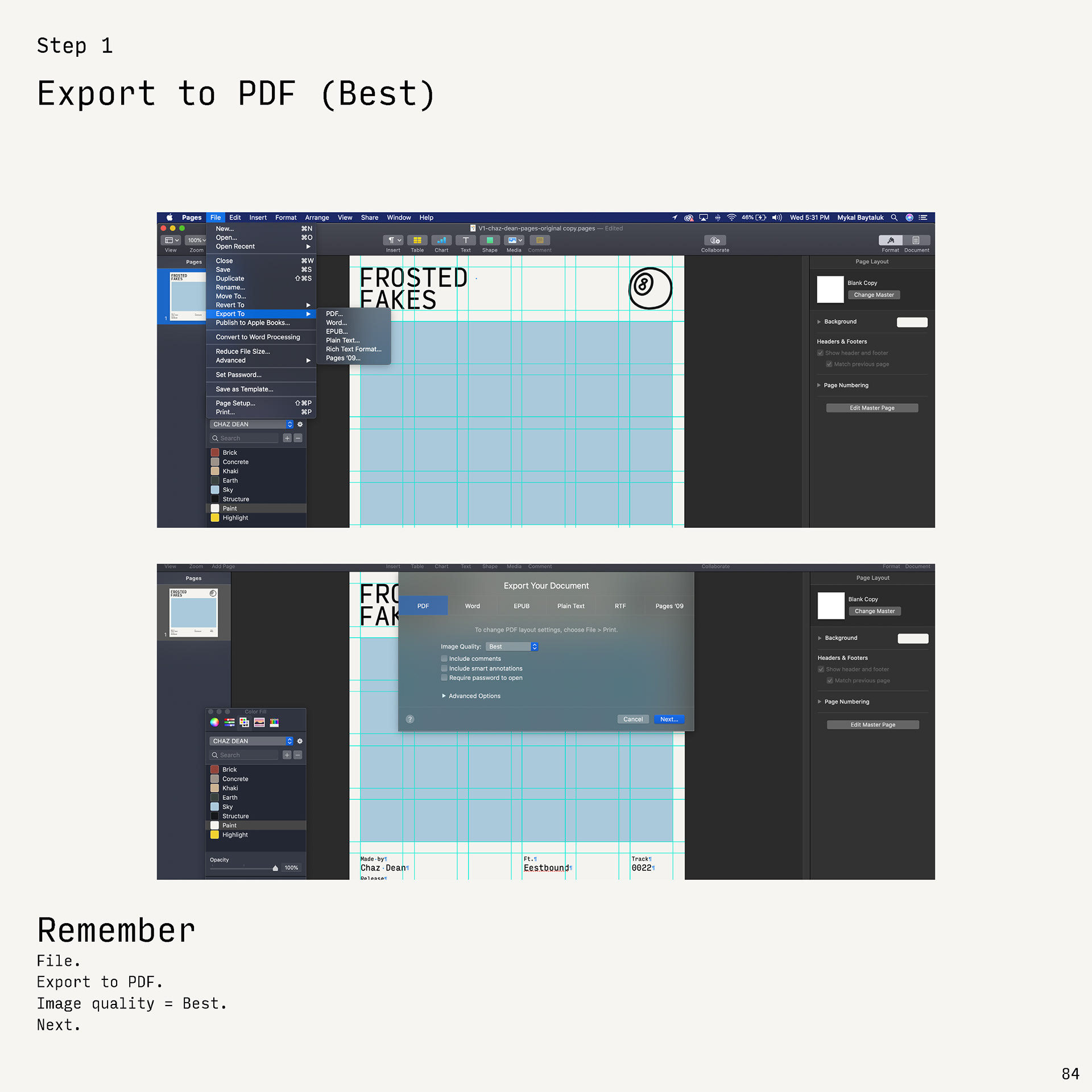
Fast forward to the Branded Template Guidelines.

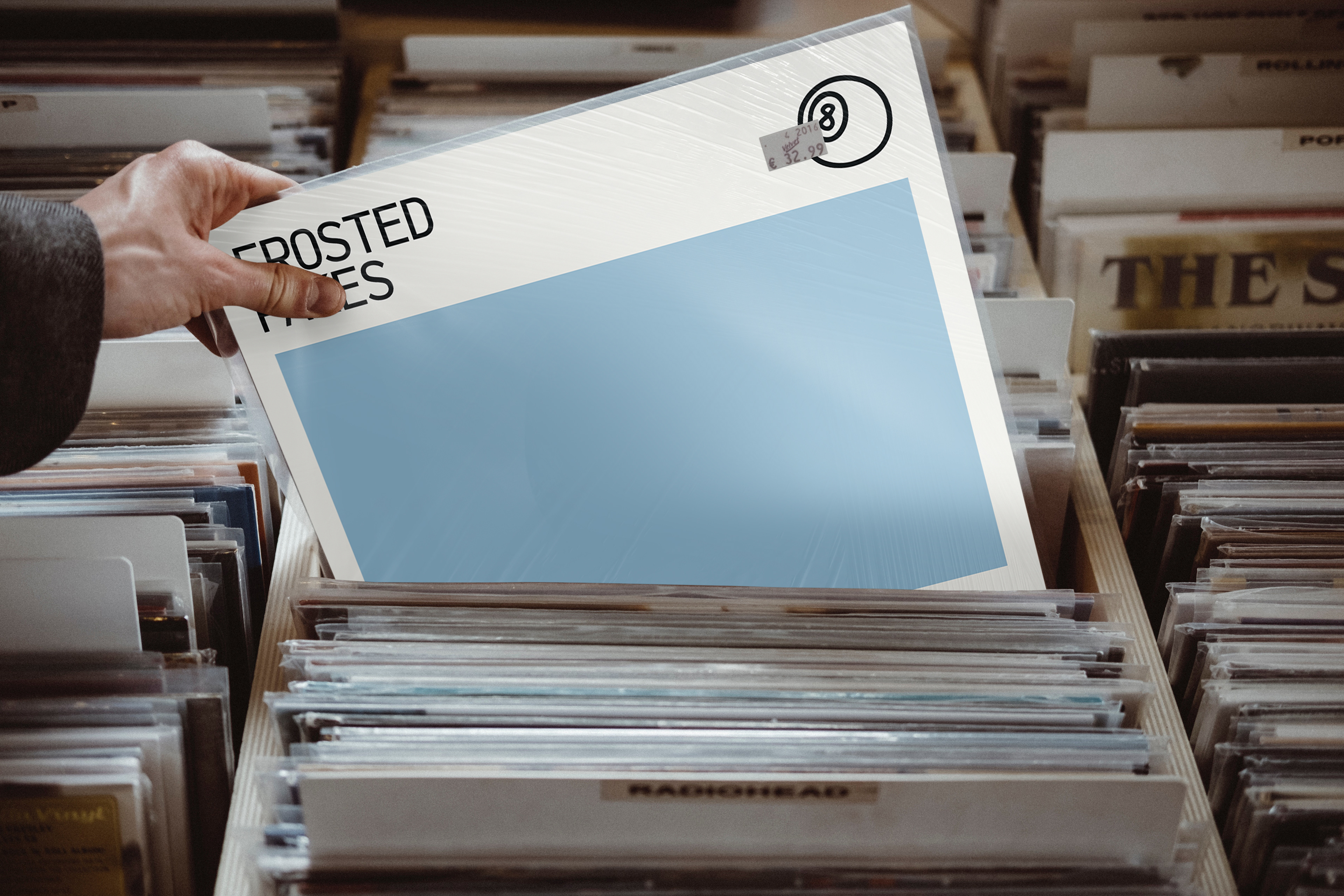
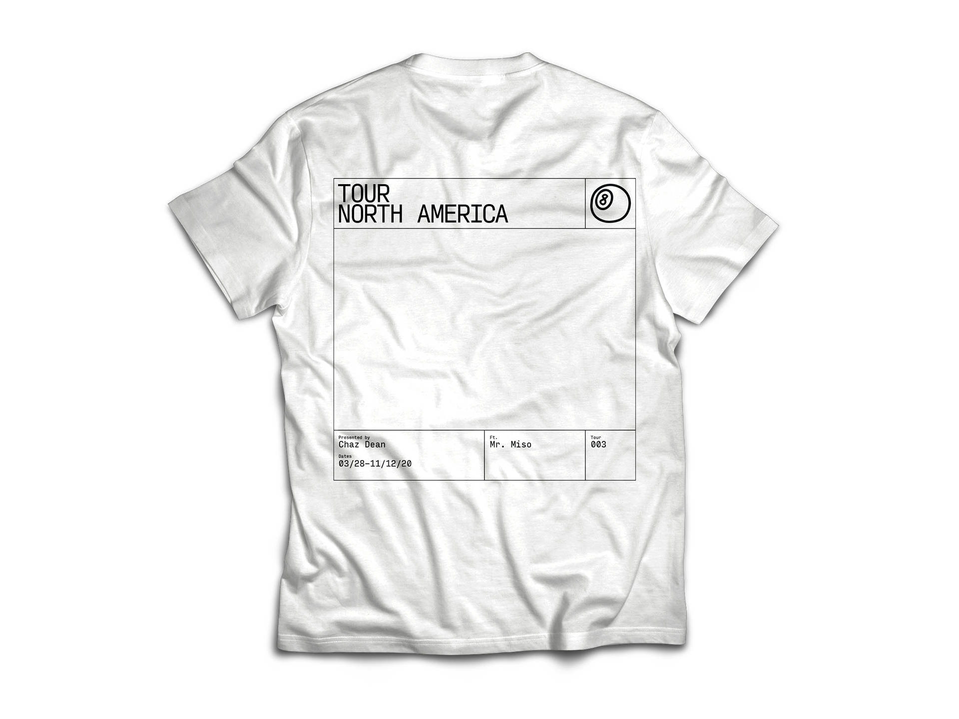
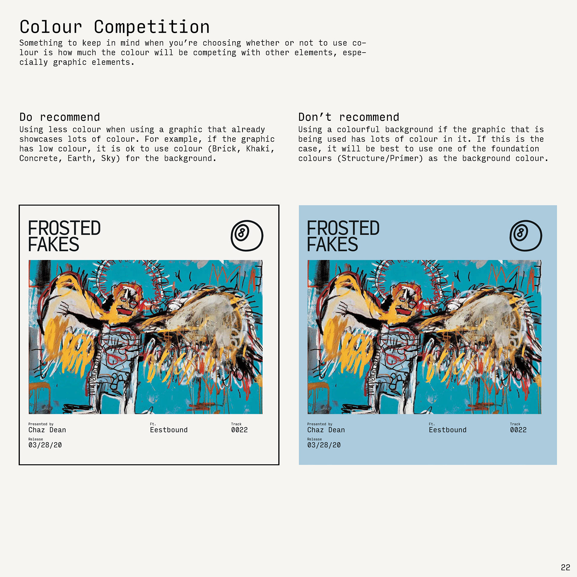
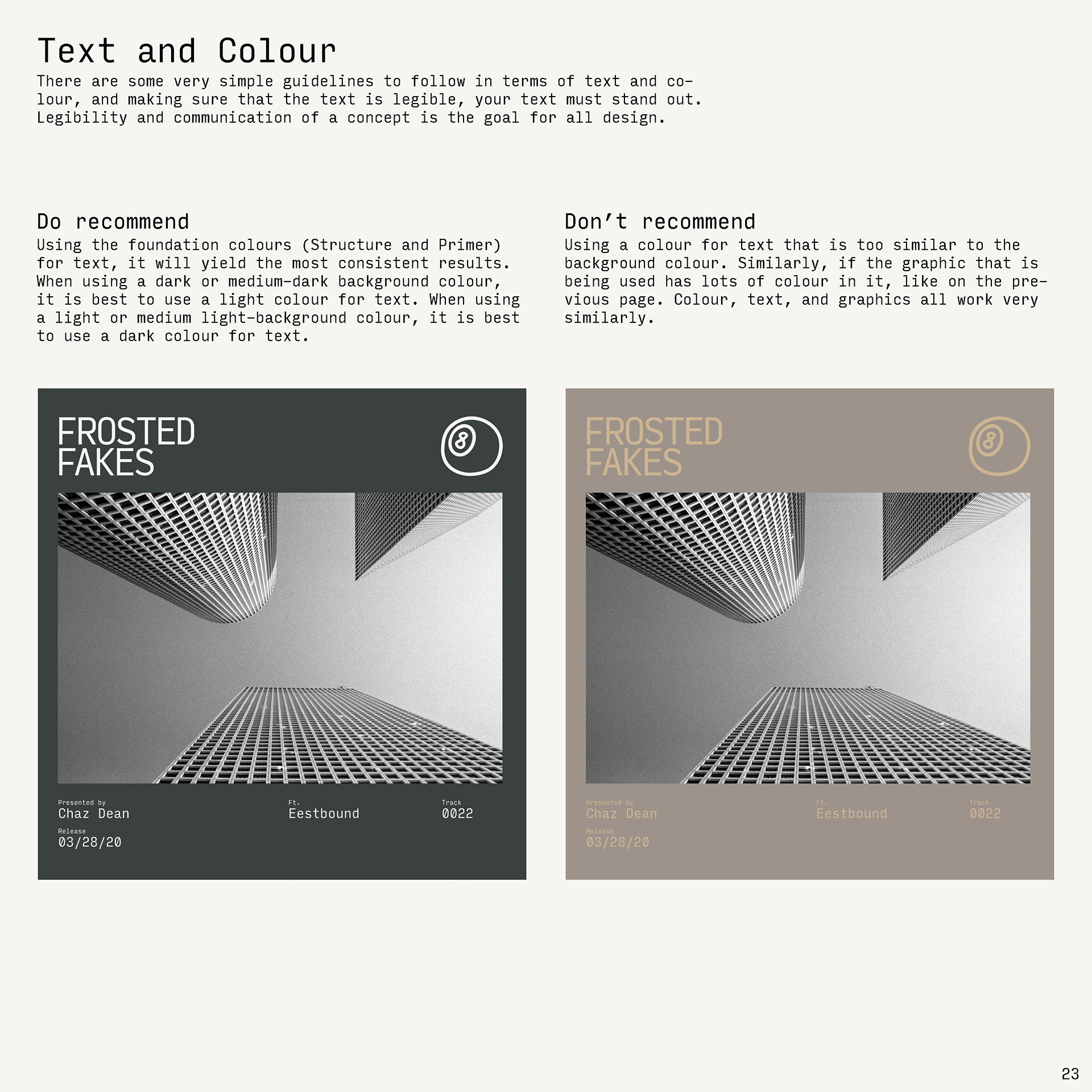
The ask was to develop a template for album covers that allowed for a unified, consistent experience, for both the listeners as well as the producer of the album artwork.
When you are an independent artist, who is also a successful professional in the tech industry, you need to find ways to streamline your processes to make sure that you can keep up with the demand of releasing content in a steady volume.
Chaz approached me to develop a template that was powerful enough to stand the test of time, that was simple to use, and unique enough to be a valued asset to his brand identity. It needed to be flexible enough that he wouldn't find himself tied down to a single style a year from now, unable to grow organically. It also needed to be rigid enough that he wouldn't have to ask questions about effectiveness while he or another employee was producing the work. I combined the two.


There were a few ways to approach this type of project but the key focuses that stood out to me were, branding (strategy and identity), longevity, and ease of production.
What makes album covers so special is that they are unique to every project. Building a template for album covers raises the concern, how will you make sure that these projects are special time and time again?
The answer to that question, from a branding standpoint, comes with another question, how do you want to approach your brand strategy (in turn affecting your brand's identity)?
What we're left with, in the case of this project, is a non traditional approach to designing album covers. As opposed to designing album covers based on specific content, design them based on the brand. Use that brand as the vehicle for delivering amazing music. It is a mindset shift.


A music artist, like many businesses that we see nowadays, has a few avenues that are most important to their brand's identity, the first is of course their voice. How do they speak (or sing, or rap) to the people that are listening to them? Following closely behind voice is the visual imagery that they use as a platform to reach their desired audience before any sound is made and heard.
What I realized instantly, was that for this to work, we were going to need to develop the visual identity of the brand in a way that these were not only additions, but key assets.
The avenues that this project needed to address were social media platforms, and music streaming/downloading platforms: it needed to be done in a way that felt tactile and traditional, due to the nature of album covers and what makes them special.


Branding has always been vital to the music industry, what makes this project so effective is that it allows this artist to produce meaningful content and have a professional face to show every time, without needing a graphic designer to produce work for each project.
You may be asking yourself at this point, why would you want to create less work for yourself? The answer to that is a shift in the way design is being used. First of all, people expect design, so as a business you need to find ways to seamlessly provide it. Secondly, for design to be effective, it needs to be unified, so I would rather help to ensure my clients success than have them scramble for solutions down the road. And lastly, technology means constantly adapting.
Design systems are the means for adapting design to technology's capabilities (this website is a perfect example of that). We are not creating less work for ourselves, we are giving ourselves the chance to evolve our work to be even more meaningful. We are also making design more accessible in most senses of the word.


By building a brand identity that focused on creating an overall experience for listeners to be able to understand the artist through visual cues, it makes all of the album covers special. The album covers adhere to an identity that is part of the artist's essence. The artist's essence is what makes the music special, and in turn, the visual identity is then relevant.
In turn, the uniqueness of this visual identity as an answer to building album covers with ease, is what allows for a solution that is timeless.
By focussing on colours and typography that are unique, combined with a consistent grid, you can maintain a cohesive and enjoyable visual experience (brand identity); one that is equal parts flexible and rigid.


One of the challenges with this project was going to be the programs necessary to build a professionally designed album cover, as an amateur, and without access to an Adobe Creative Cloud subscription.
The word challenge is not a bad word, it's an exciting one, it's a chance for progression and solutions.
The solution to the challenge of building professional quality album covers, in this case, was to build the template in Apple Pages! Pages is an application that comes free with everyones MacBook, it is user friendly, and believe it or not, it gets the job done.
With paragraph style capabilities, the ability to build grids and colour palettes, and of course access to the use of shapes and images, Pages really does solve the challenge of producing quality work without an understanding of or access to design software.


Follow along at the link below: