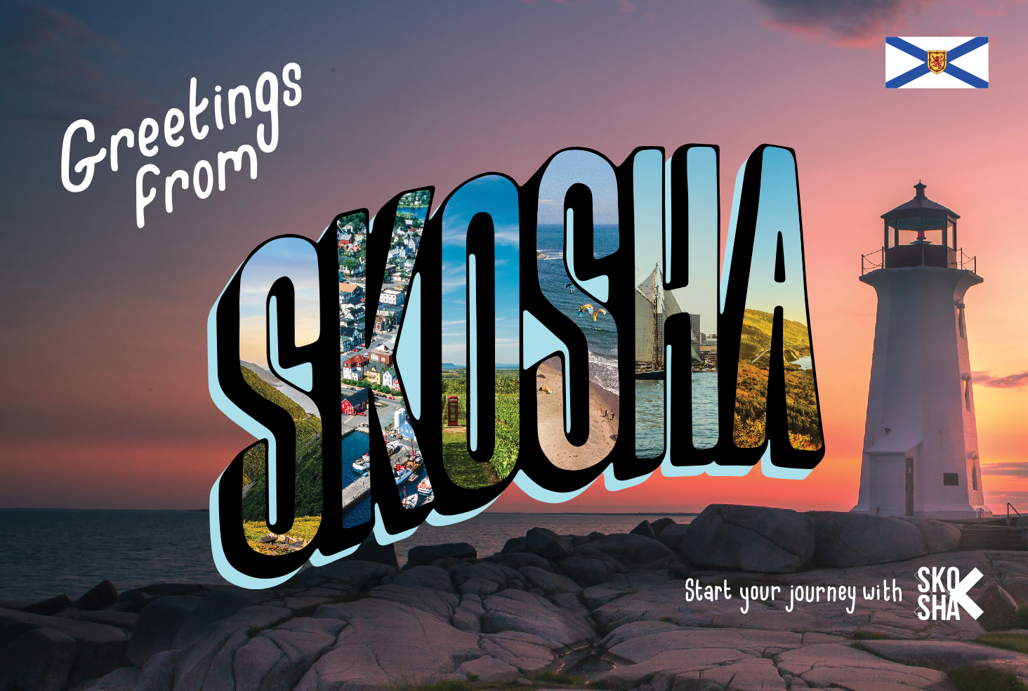
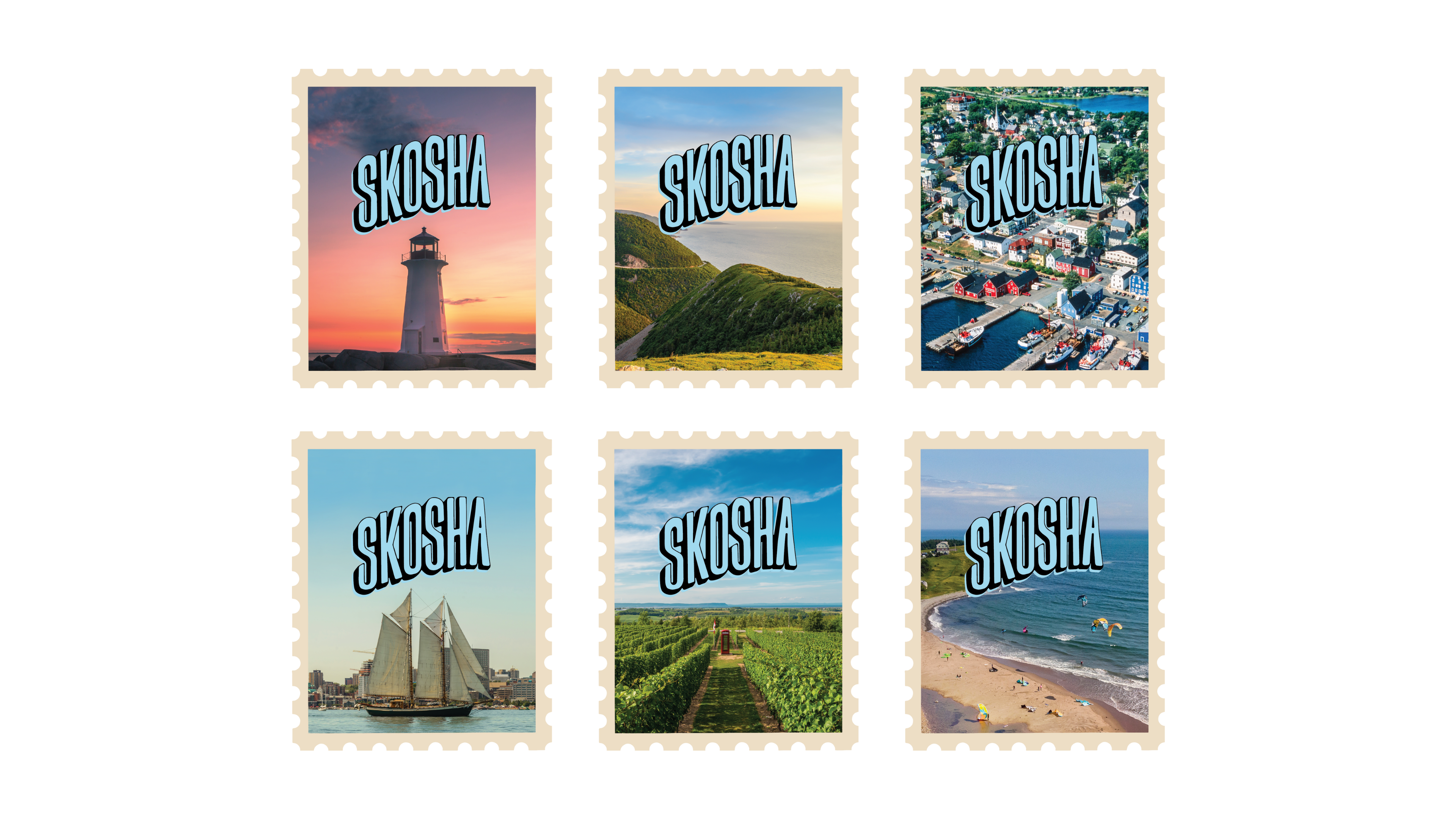
POV: You’re the provinces first licensed cannabis producer, you’re a growing corporation, and you’re about to take the rest of the country by storm.
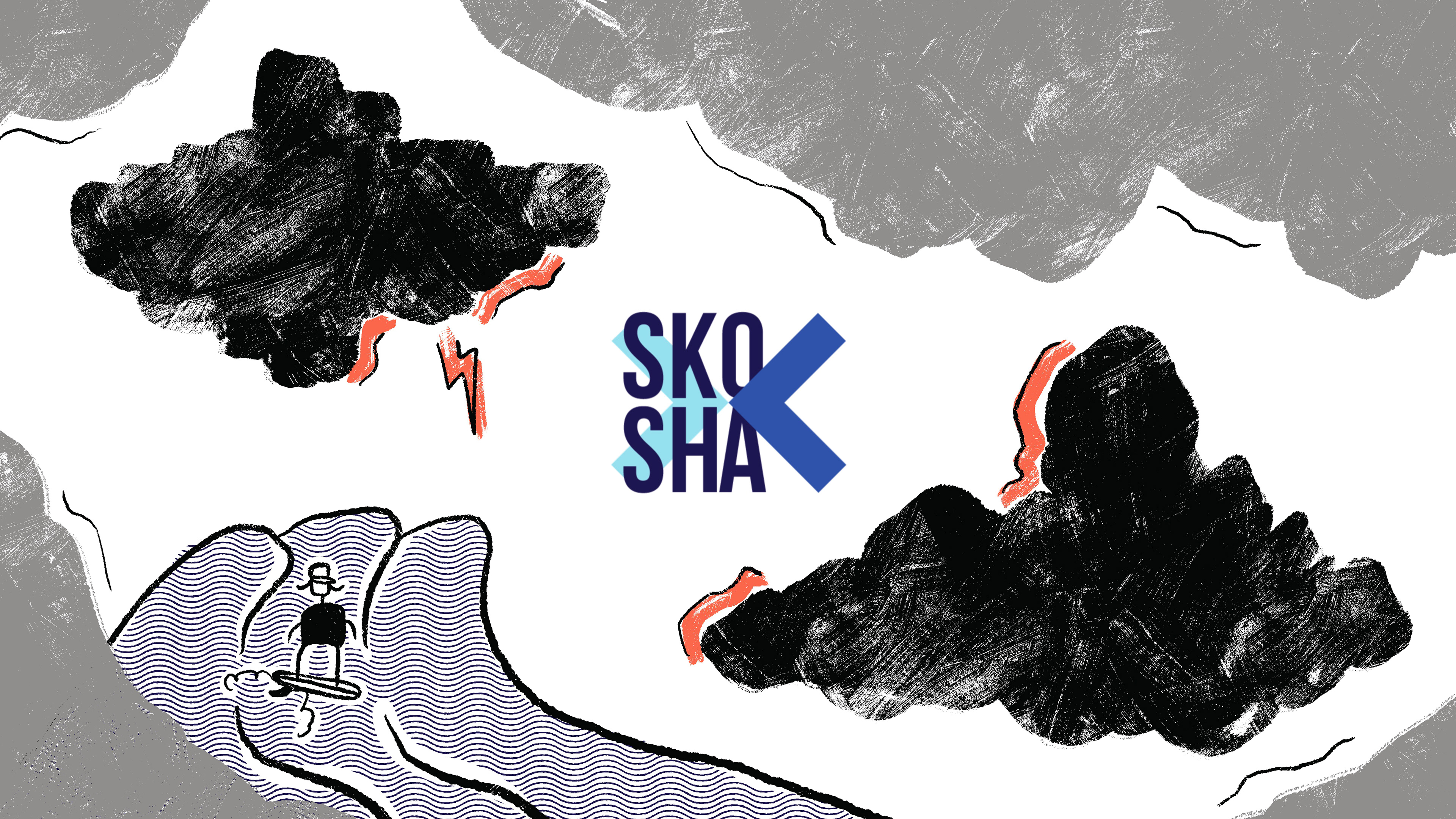
What started as a project to develop an illustration style for an ad campaign to run across the province turned into a two year long relationship of building and directing a wide range of nationally distributed projects.
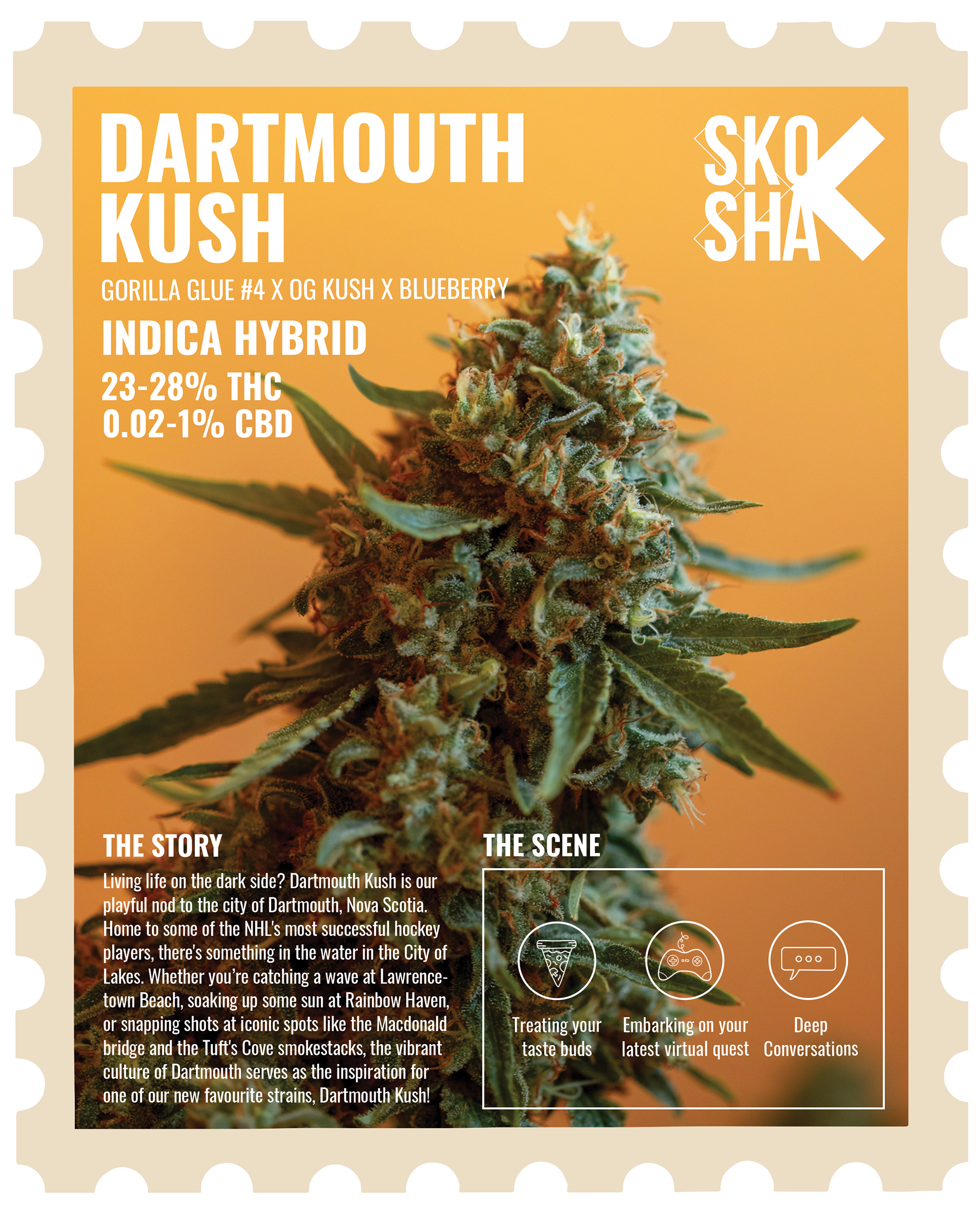
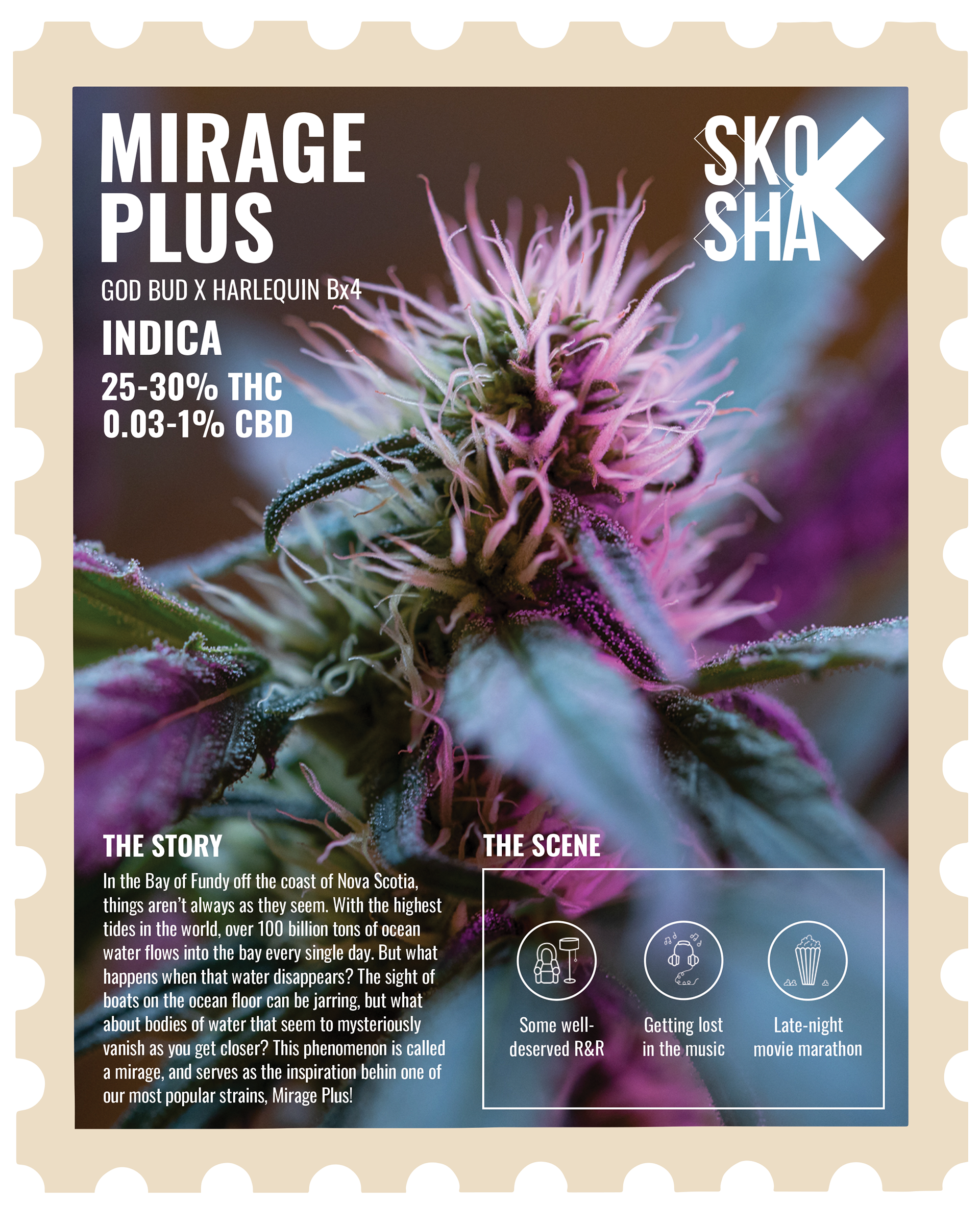
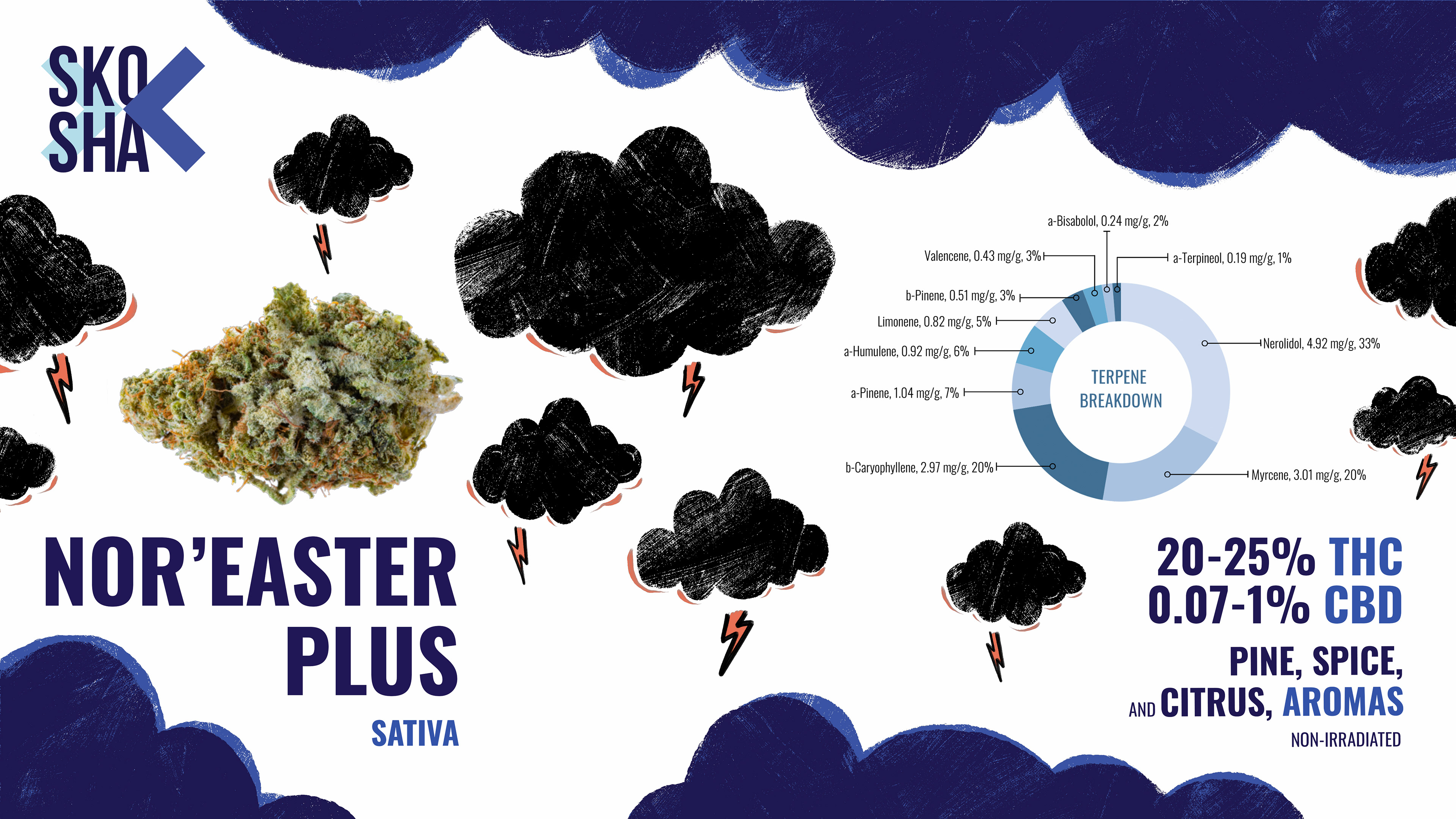
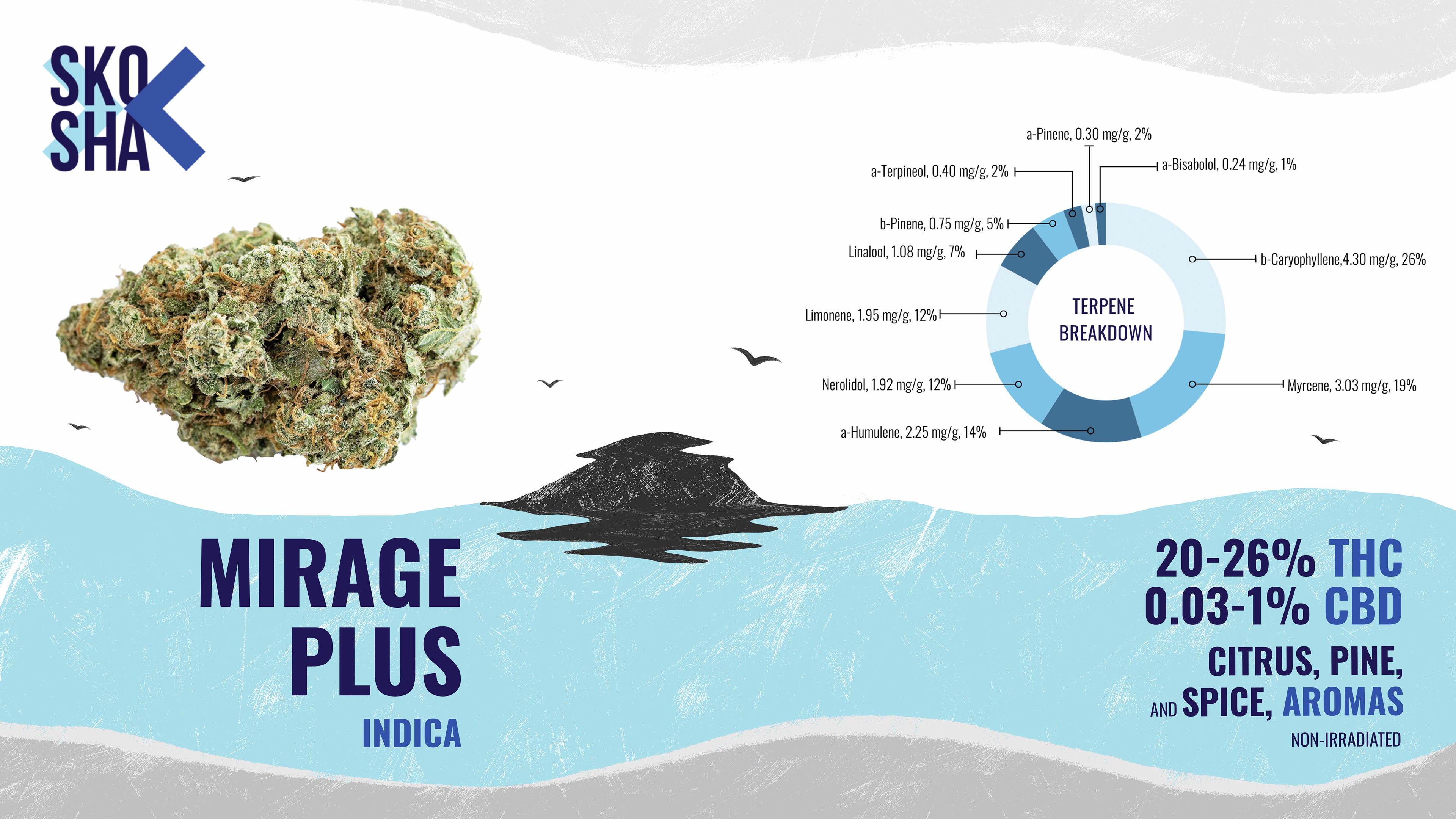
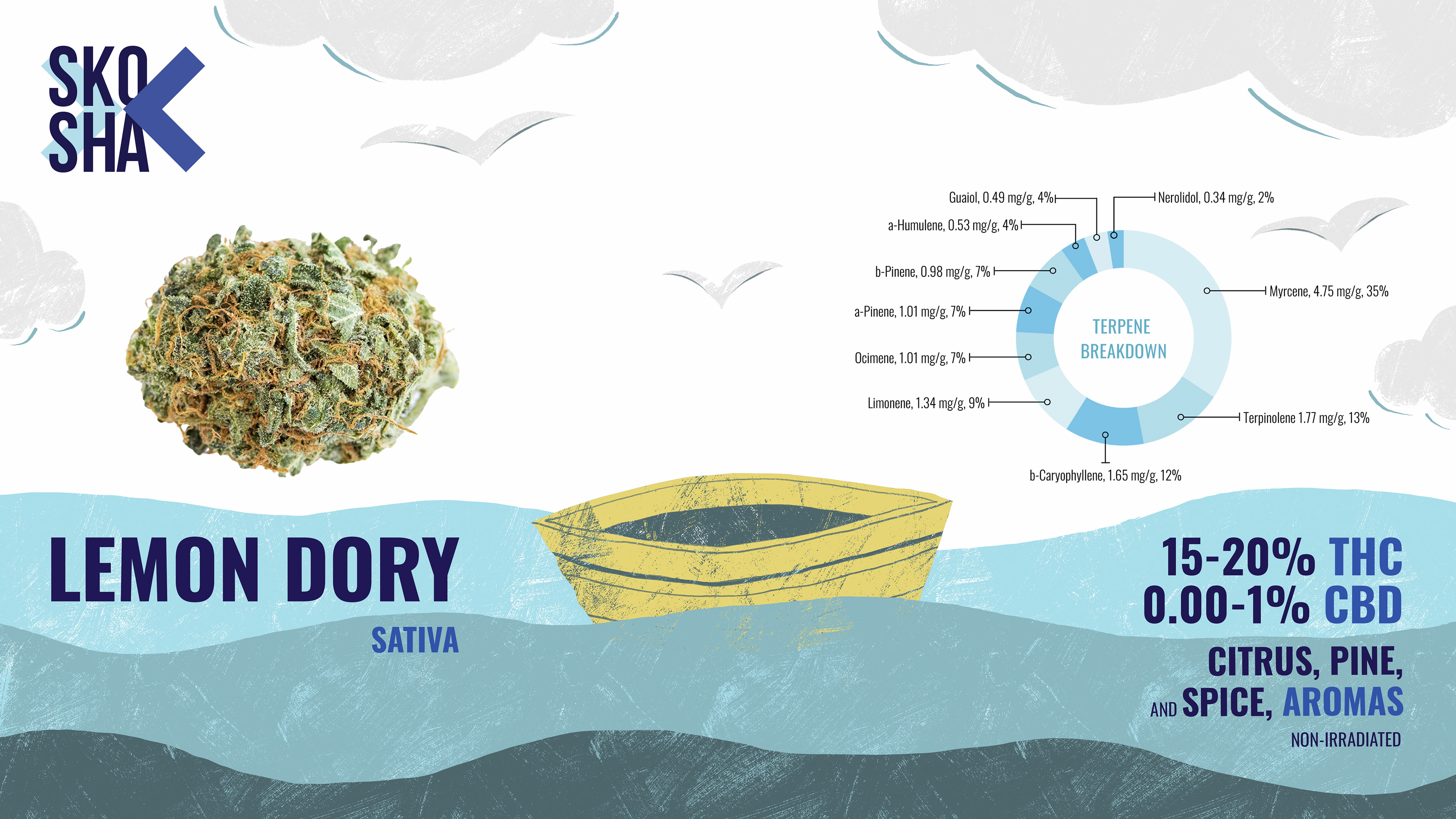
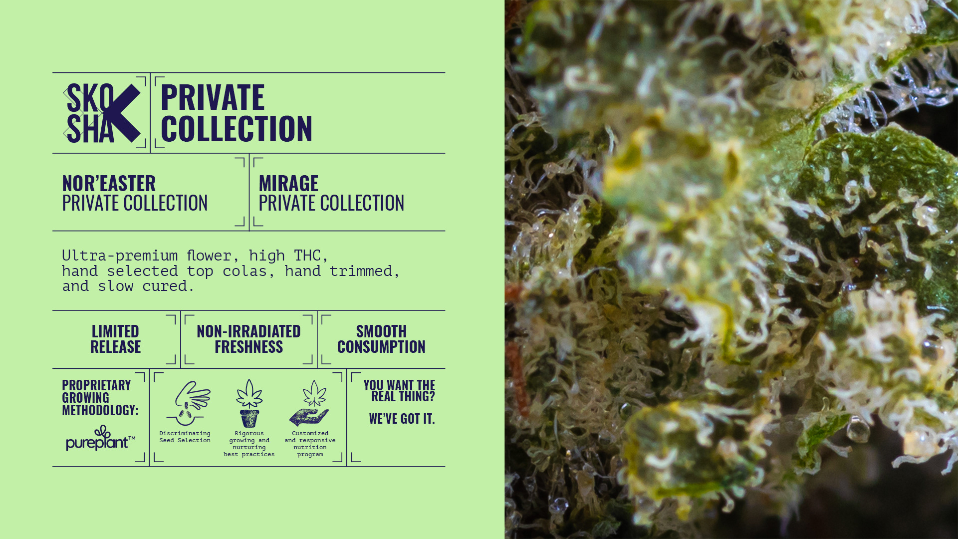
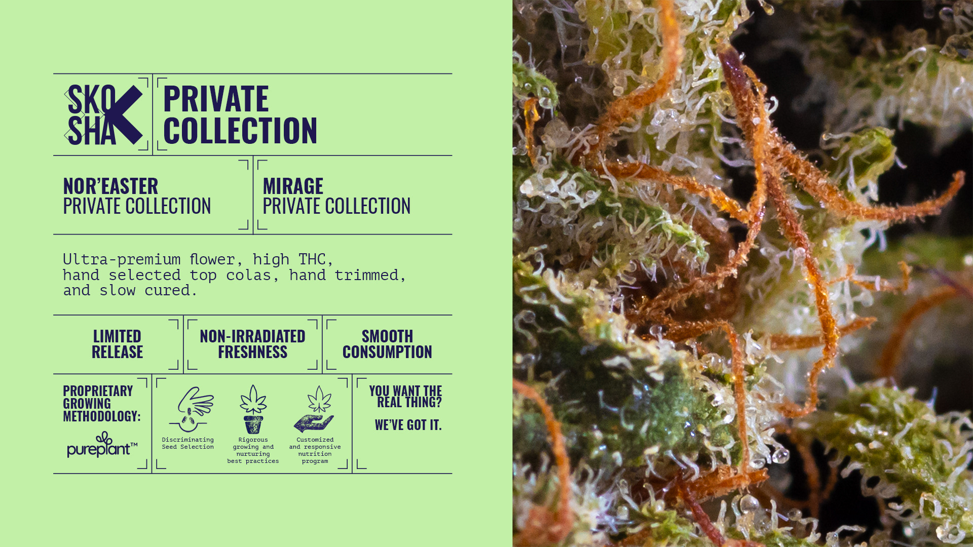
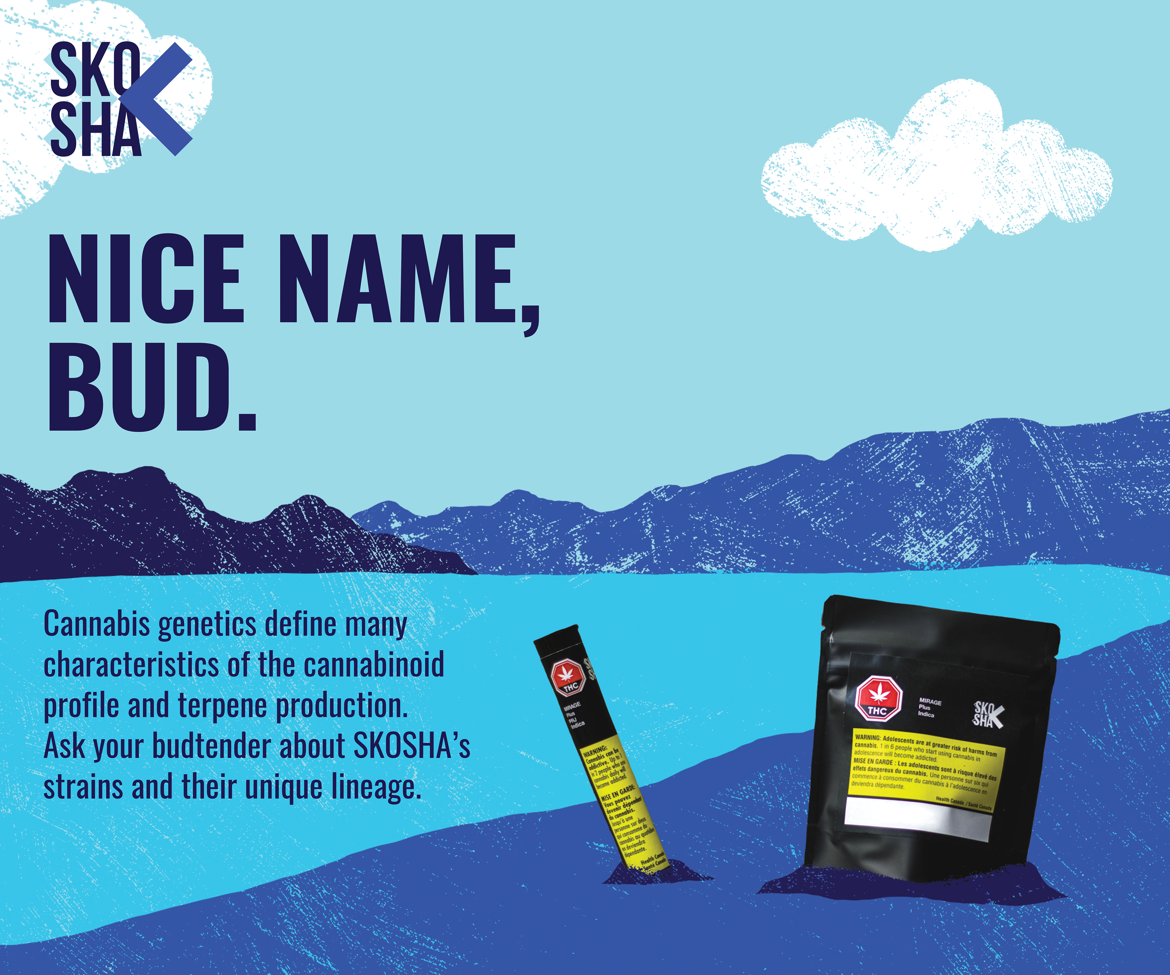
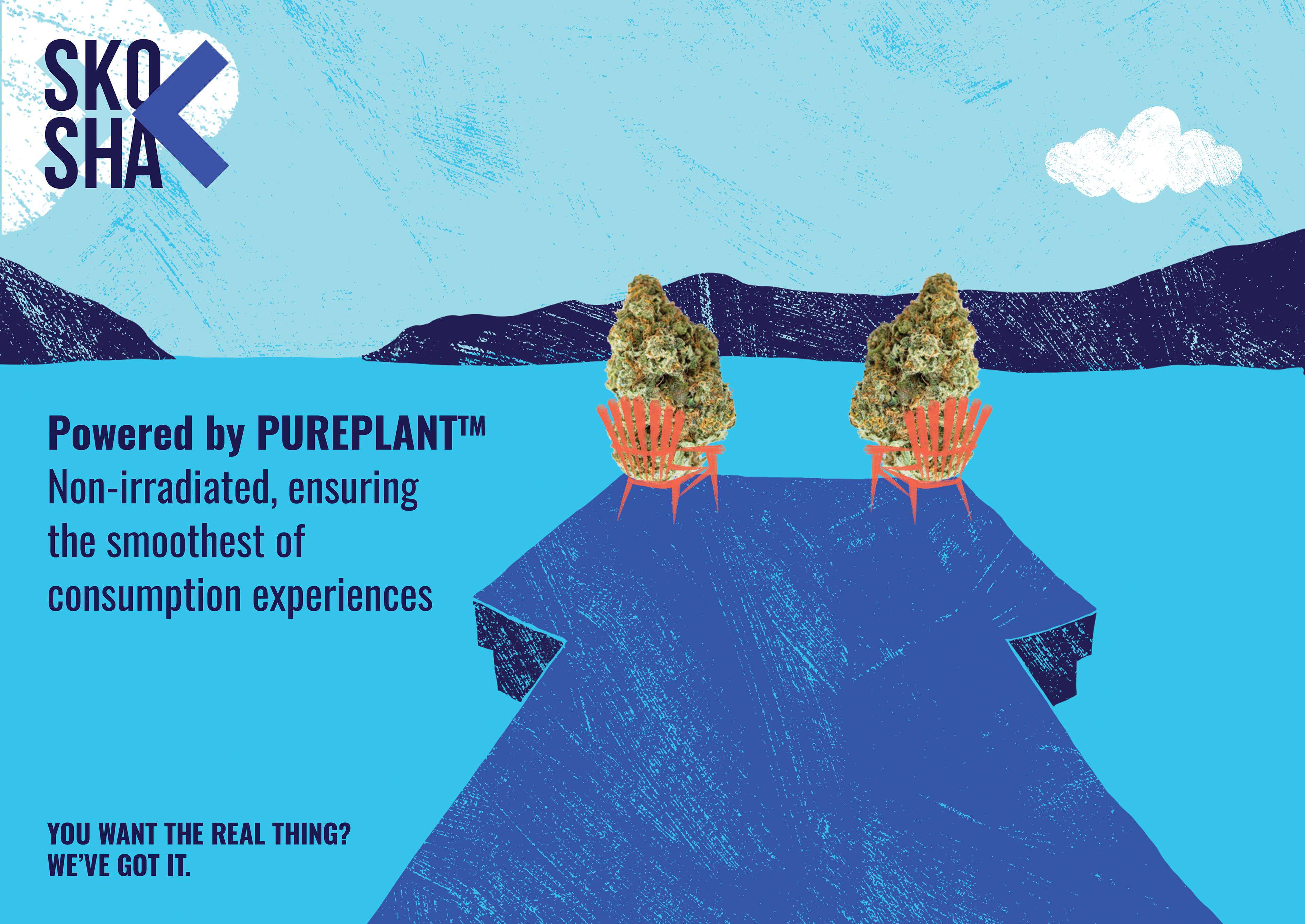
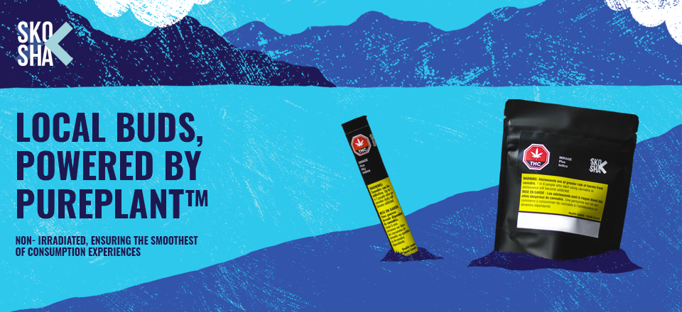
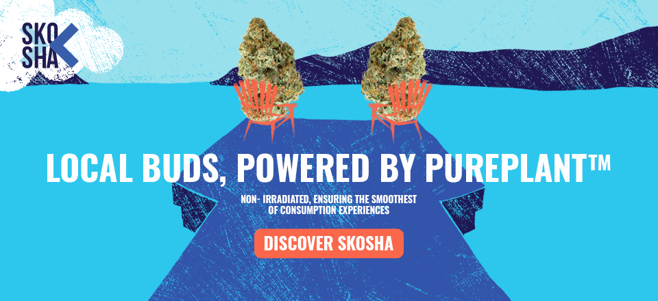
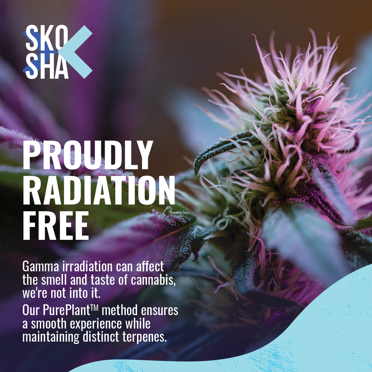
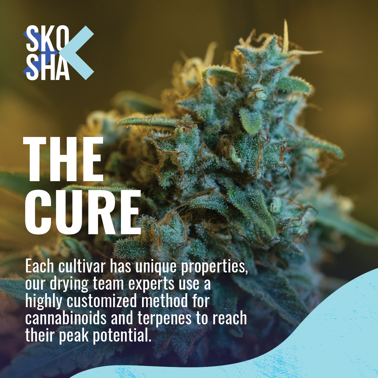
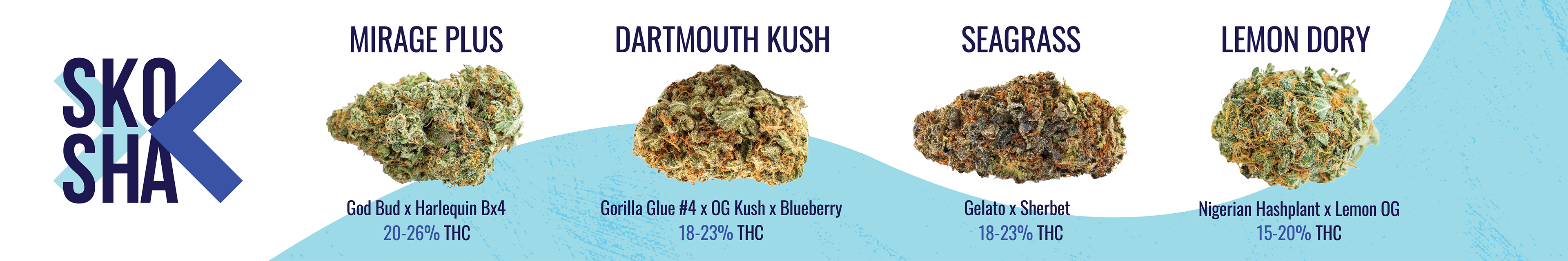
Below you will find everything from brand design and illustration, to videos and photos that were art and creative directed, to an entire campaign that more than doubled Skosha's Nova Scotian sales.